16 March 2022

Another ghostsign – Benjamin, Shepherd Market, Mayfair

You probably think all I look for and write about about these days is ghost signs. Well, that's not true – I've got a folder fit to bursting with mosaics, ironwork, etched glass, architecture from all eras, parks, gardens, and lots more that I just haven't the time to collate. 

It's just that when I spot a faded sign on a wall I stand there scribbling notes that, when I look at them later, are almost undecipherable (just like the sign!), hence I do the research for these asap, while it's all fresh in my mind. This is exactly what happened yesterday when I was walking around Shepherd Market in Mayfair, planning an idea for a guided walk in the area. 

I'm surprised I haven't written about this sign before, or indeed this enclave of delightful little streets which still has that village feel. It's not as if I have only just noticed it. I rather assumed, with it being so obvious that someone else had written it up already, but that doesn't appear so. 

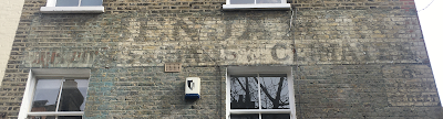
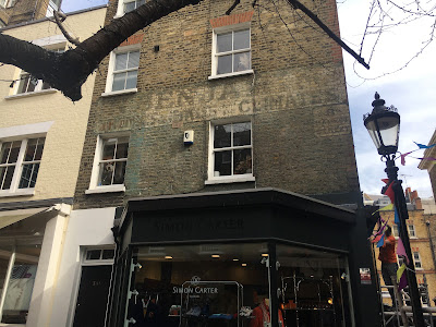
The sign sits above the corner shop, today No.34 Shepherd Market. However, back in the day this was No.8 Market Street, as is clearly shown by the hand-painted street sign. 

N. BENJAMIN / TRUNKS & BAGS for all CLIMATES. 


There is also some over-painting, mostly in the secondary line, so the name and the product/service could be from two different eras. 

In 1910 Edwin Alexander Atkins, trunkmaker, was at this address and this ties in perfectly with the products offered, but the name is wrong. He also had another shop opposite at No.10 selling boots (sort of where I took this photo from)

The sign is evidently for Nathaniel Benjamin, portmanteau dealer, who, in the same year, was next door to the boot shop at No.12. Tho why Atkins would want the name of his immediate competitor advertised on his own building is beyond me. Perhaps these men were related. Or perhaps Atkins offered smaller bags whist Benjamin offered larger ocean-going luggage for those Grand Tour experiences and the two companies bounced off each other? 

H. V. Morton mentions this shop in his wonderfully engaging book Ghosts of London first published in Nov 1939:


As ever, any further info welcome.

Update May 2026 – I recently found this pic below showing the street in 1967 (a screen shot from my phone) – the photo and info about it can be found on London Picture Archive here.

13 February 2022

Blooms Pianos, Kingsland Road – two signs and at least four workshops

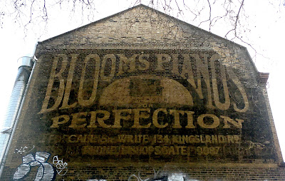
I was in Shoreditch recently, wandering about admiring things, planning walking routes and generally enjoying the Winter sunshine. I decided, as I was close by, to go and visit an old friend, the hand-painted sign for Bloom’s pianos on the north side of the block that overlooks the front garden of The Museum of The Home. 

BLOOM’S PIANOS
Illustration of upright piano within a semi-circle
FOR PERFECTION 
CALL OR WRITE: 134 KINGSLAND RD.
PHONE: BISHOPSGATE 9087 

When I got home, I tried to find out more info about its content, but available information was scant and I ended up with more questions than answers. I had read that this sign was created for/by Philip Blumher, a Russian immigrant and master cabinet maker who "spent most of the 1930s trading here" having anglicised his name to Bloom, yet there was no evidence to back up this information. And so began days, nay weeks, of bloomin' research (see what I did there?!)... 

Let's at first look at the design of this large hand-painted sign – it is clearly Edwardian/early 20th century in style as regards the letterform with those blobby serifs, undulating cross bars on the E and F, that lovely kick on the R, the curves, warps, arcs and stretches and, of course, there's that upright piano at the centre. 

Also, there are direct telephone numbers on it – exchanges of this kind did not become available until 1912, though I cannot, as yet, ascertain who the Bishopsgate 9087 number belonged to, and, despite the directional at bottom right (in the form of a manicule, a cuffed hand pointing to the front of the building), I can find no ref of any Blooms listed along this terrace in the 1910s. Though they make an appearance in the 1930s. Read on...

134 Kingsland Rd is the address of the whole block from the Museum of the Home to Cremer Street and comprises seven premises A-G. If this sign is from the 1910s then it's likely that this excellent advertising space, facing the traffic coming into London from the north, was simply used to advertise products made at nearby workshops, the sign being commissioned by an enterprising family of cabinet makers who made cases for pianofortes and had connections to someone in this block who could accept correspondence on their behalf. This might well have been William Richard Mitchell, shopfitter, who was at 134D&E in 1914, or Clarke & Greenfield, glass mould makers, at G. Indeed, in 1925 every one of these spaces is occupied by a company making or selling something to do with furniture. 
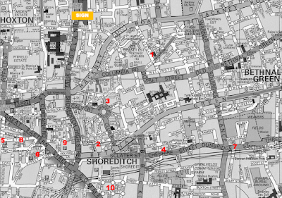
Bloom is a fairly common (adapted) Jewish name and there have been many cabinet makers by the name of Bloom living and working in the Bethnal Green and Shoreditch area. For instance, in 1899 there was Joseph Bloom at 54 Ravenscoft Street (1), a road that was mostly cabinet makers at that time, and Nathan Bloom a short walk away at 29 Redchurch Street (2). Then, by 1910 Marks Bloom is at No.64 Ravenscroft St (1) and Joseph has moved into new premises at 5 Sunbury Works, Hocker St (3). To muddy the waters further, in 1910 there was also Leckstein & Bloom in Cheshire Street (4) with other workshops in Tabernacle Street (5) and Christina Street (6), and by 1915 Jacob Bloom is working out of Dunbridge St (7), Israel Bloom is in Leonard Street (8) and Barnett Bloom can be found at New Inn Yard (9). I have no idea if they were all related, but it's very possible.
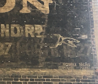
Phew! So I’m thinking this sign could be just pre-WW1 which is backed up by the signwriter’s name, written in small ‘one stoke’ at the bottom right corner: Howell Signs, Clerkenwell – 7275.
In 1910, John Thomas Howell, illuminated signs, was located at 2 Vineyard Mews, off Farringdon Road, but he’s gone from there by 1914 and I can find no evidence thus far of him being connected with that Clerkenwell phone number at that time. 

It is interesting that Howell was not local to Bethnal Green, E2, and I wonder if JTH might have been a friend or work associate of the Bloom family because I notice that Mozart & Co organ builders were at nearby 32 Vineyard Gardens from at least 1895-1910, so it's possible that the music maker connects them all, such that Mozart's mechanics might have been housed inside cabinets made by Bloom. 

The Clerkenwell 7275 phone number makes an appearance in the 1923-25 directories when Lionel Victor Howell (JT's brother or son?) is listed at 10 Penton Place, Islington (Angel area today, but classed then as part of Clerkenwell) and the phone number is carried to larger premises in the 1930s, just around the corner at what is now 91-99 Pentonville Road here.

Another idea (ooh, I am full of them!) I wonder if was J.T.Howell who painted another similar-looking sign that includes an early C20th illustration, for Daniel Leakin’s valet and car hire service at 19 Wellington Row which is on the corner of Ravenscroft Street, coincidentally a couple of minutes' walk  from a Bloom workshop in that street. It's very likely that, just like the Bloom's sign in Kingsland Road, this was initially an advertising site used to advertise services that were available close by. This is a small cottage-style terraced corner house so it's very doubtful a fleet of vehicles etc could be kept here. Until 1915 (just after I've lost track of any signwriters by the name of Howell) this corner location is shown as John Bates, coal dealer, who I think lived there and used it as his office. The vehicle depicted looks to be a 1920's Ford Model T light commercial in production 1908-27. As far as I am aware Leakin does not make an appearance here until the 1930s. But I've gone off on one of my tangents here, so let's park Daniel Leakin and his interwar motor haulage company for now and get back to the Blooms.

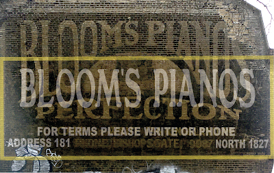
As I have hinted in the subject line, there is actually a second sign here which starts further down, sort of halfway through the big letters. If you look closely you'll notice that the lower two thirds are stronger in colour than the upper part.

I have here warped and stretched my original photo to better illustrate this. The tinted yellow box rule shows where the edges of this later sign are visible and in white I've added the letters I can ascertain thus far (though I have guessed the word 'please' at the centre).

At the bottom right there is a different telephone number from the earlier Bishopsgate one. This is confusing because, in 1939, this NORTH 1827 number belonged to George William Every & Sons, gear cutters of 49 Thornhill Road, N1, an address in Barnsbury, Islington, which is a short walk from the Blooms outlets in Caledonian Road. The Everys were in Barnsbury for at least 30 years – in 1910 they are listed as ‘clock wheel makers’ and were probably at that time supplying the Clerkenwell clock-making area. But the question here is, why on earth would Blooms be using Every's phone number? Hmm, ponder ponder... perhaps, again, this was merely for correspondence address rather than a place to buy... 

I then considered the number 181 at the bottom left corner and which road in the area might this apply to – my hunch being that it must be one of the shopping streets in the N1 area. I quickly found Blooms House Furnishers (Isaac Bloom) at 181 and 187 Caledonian Road in 1939 as well as opposite at No.198, which explains that hard to decipher part in the centre of the last line = ADDRESS 181 CALEDONIAN ROAD. (Update: I have since ascertained that  'ISLINGTON' is between the road and the phone number). 

Back to Kingsland Road and our Russian friend Mr Blumhert... 

I have been told that in 1930, Bloom Bros cabinet makers were at 134 C, D & E, but they'd left the site by 1940. I suspect this might coincide with the opening of the outlets in Caledonian Road, the Kings Cross area probably being better for transport and distribution, and also closer to the many piano and organ makers in north London, specifically in Islington and Camden, north of the canal.

There are no Blooms listed in the 1939 directory at the Kingsland Rd address. However, Nathan Bloom was, at this time, still busy at his workshop at 29 Redchurch Street (2 on the map above) and he had also taken on additional premises at 19-21. There’s also H&L Bloom at 3 Fountain Street, a premises that backs onto Sunbury Works (3) which must surely must be the same family seeing as this was where Joseph was listed two decades previously. 1939 also shows J. Bloom at 24A Calvin Street (10), within an attractive terrace of workshops which still looks good today. 

As regards the design of the ads, note that the smaller/later advertisement has no illustration. OK, so there was less space, and the inclusion of an illustration was probably expensive, but perhaps pianos, even the ones in beautifully-made wooden cabinets, were not as much of a selling point by the time this was painted, especially with domestic gramophone players becoming more affordable.

But I have an idea why the newer sign is less tall... if you study that end wall today, or look again at my pics above, notice how the bricks at the Kingsland Rd side have been replaced – the uppermost front section of the wall has been rebuilt. It occurs to me that this might possibly have been damaged during WWI Zeppelin raids – the red line on this map clearly shows that two airships passed quite close to 134 Kingsland Road in May 1915. Alternatively, if it's a1930's sign that was later repainted, this could hint at it being repainted during or shortly after damage during WW2. The date of the second hinges on when the Blooms opened those premises in Cally Rd.  I'd love to see how the wall above the thinner sign would have appeared at the time it was created – perhaps the visible elements of the earlier sign at the top were overpainted in black. 

I am still torn as regards the date/era of these advertisements. The available information is intriguingly inconclusive. The style is 1910s but the info within seems to be hinting at the 1930s which, to me, is at odds with the old fashioned letterform used. Perhaps they used a logotype in this fin-de-siecle style, hence why the letterform continued through the decades...?

I think I will stop now as I’m bloomin’ exhausted. 

Watch this space for more updates, as I will amend the info above as and when I find out more. If you can help, please use the comments box below or contact me @janeslondon via social media.

10 February 2022

Shaftesbury Hotel ghostsign – a bargain price at a great location with breakfast and billiards

This might be the best hidden-in-plain-sight ghostsign in central London.

I have been busy pulling together some online talks about old defunct and faded signage of all kinds in central London, specifically Soho, Covent Garden and Fitzrovia. This has involved revisiting and updating my 'show and tell' folder and the accompanying notes for the central London walking tour I have been leading for the past three and a half years. 

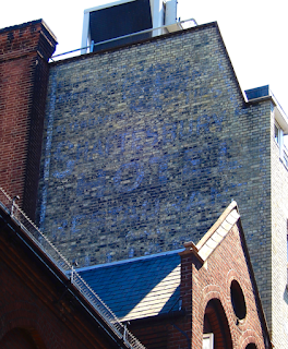
When I first devised that route from Long Acre to Rupert Street, a friend and I test-walked it one sunny winter's day in Jan 2018. As we used the zebra crossing on Shaftesbury Avenue, heading from Seven Dials to St Giles Church, we turned to look back up Mercers Street just in case we'd missed anything and were amazed to spot a sign that neither of us in all our decades of wandering about armed with cameras had never noticed before. Way up high, facing north, there is a hand-painted sign on the back of what is now The Mercer Street Hotel.

Had it been covered and made a sudden appearance? Doubtful. We think we'd simply missed it due to the tree on the corner of Mercer Street than when in leaf as good as obliterates the sign completely for most of the year. Also, the sign is only visible from a couple of specific spots along that junction. Blink as you walk past Mercers Street and you'll miss it. See Google streetview here.

I returned to the site a few weeks later and did my best to take some photos. And I've tried again a few times since. It's difficult to get a decent view of it, because the weather, the angle of opportunity and the faded blue/white letters obscured by what looks like layers of black soot all play their part. I'm really glad that I have returned to all this because I was convinced that I had added this discovery to this site ages ago, but no, it turns out it was still lurking in my 'To Do' folder as a simple note to self.

This is what I have found out so far... 

The Shaftesbury Hotel was constructed on a site that previously George Russell's rope and twine business at 47 Great St Andrews Street (later to be renamed Monmouth Street – you'll see refs to these old street names on the road signs in the area). Images of Seven Dials, dated 1910, show the hotel covering the site of nos. 43-47, and this is corroborated by the gap in the directory for that year, hinting that the building was nearing completion. I think we can assume that the sign was painted onto the rear of the building during or shortly after construction, intended to be clearly seen by traffic coming down St Giles High Street from the junction of Tottenham Court Rd station when buildings in the vicinity were much lower than they are today. This hotel was probably at that time one of the tallest in this area.

It would have been an unusual and brave move to open a hotel here, albeit a cheap/budget one, in a district that had previously been tainted during the late Georgian era as being inhabited by thieves and prostitutes, a stone's throw from the rookeries of St Giles as depicted by Hogarth in Gin Lane. But by the 1880s the street of the Seven Dials had evolved to become merely an area where the working classes lived and worked, with a thriving street market. A clever entrepreneur must have seen the value of the central location as we do today.


I have done my best to decipher the wording on sign. I've boosted the pics using Photoshop and then on tracing paper hand-rendered the words that that are visible. My pencil marks indicate a few bits that I am unsure of, such as the wording above BREAKFAST which is probably BEDROOM being there are hints of a B and two OOs there. The big 4 looks to have been in a circle and was probably 4/- (four shillings) per night for a room, which equates to about £25 today. Wow! 

Billiards was very popular in the late Victorian era, especially within Temperance Halls, and I wonder if this was constructed as a Temperance Hotel being as the design of the building is similar to some others that were constructed in that era, such as The Kenilworth in Gt Russell Street near the British Museum, where activities and good food would have been an attraction rather than alcohol. Note that a bar/drinks lounge is 'missing' from the list of facilities offered on this painted sign. The 1915 directory sheds no light on this idea and simply shows it as Shaftesbury Hotel, Thos. Gordon (London) Ltd., at 44, Great St Andrew Street.

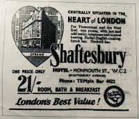
I also found this ad for the hotel in a 1953 guide book to London. As you can see, it is advertising the hotel's prime location as close to Theatreland and the West End – the heart of London. The price still equates to about £24 a night. You'll be hard-pushed to find a warm cupboard for rent at that price today!

An online search throws up no additional info or photos, indicating that no one else has spotted this corker of a ghost sign either. Ooh I feel like a treasure hunter who found gold! 

I am still intrigued about the two lines under BILLARDS which are not visible from the street... Can anyone give me access to the roof of the Odeon, Shaftesbury Ave?!

................

UPDATE (20th May 2022) – Sam and Roy @ghostsigns have finally caught up with me about this – they posted this 1917 ad on Twitter which backs up the wording on the painted sign:

This WW1 era ad shows the hotel proprietor as T. Gordon (London) Ltd., suggesting the company also managed other hotels/properties. This very same ad can also be found on the back page of the September 1918 Anzac Bulletin here – a fascinating read in itself. 

UPDATE 2 (12th May 2025) – a big thanks to Celia who contacted me via email and included this snap of an ad on the inside back page of the 1927 Authorised Guide to The Tower of London:

It's interesting to see how prices fluctuate. The price in 1927 per night/room (person?) is shown as 7 shillings and sixpence which, today, is equivalent to £32.30 and is therefore more comparably expensive that the rate in the 1900s and the 1950s. Note also that billiards is no longer advertised, helping us to date the hand-painted ghostsign as pre-1920s, and there are 15 fewer rooms available than in the 1917 ad above – I wonder if larger rooms were created or perhaps they were converted for other purposes, such as Jazz Age cocktail lounges

8 February 2022

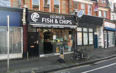
On the tiles at George's Fish & Chips shop, 45 Tottenham Lane, N8

At the northern end of Tottenham Lane, on the right and just before the fork where the road meets Church Lane and leads down to the right and Hornsey railway station, there is a fish and chips shop, opposite the old police station buildng. 

The shop doesn't look like much at first glance, being as the exterior is modern plate glass, having lost almost all of its Victorian metalwork and embellishment over the past few decades. You need only to look around at some of the nearby shops to be able to get an idea of how attractive this junction would have been 120 years ago. 

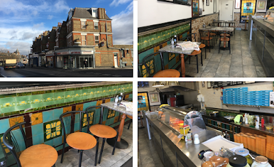
If you venture into George's you'll find some fabulous examples of fin-de-siecle tiles along the lower sections of the walls on both sides, specifically in the small seating area at the left and behind the counter too, albeit mostly obscured by cabinets. But hey, they are there and that's great.


These tiles really show off the colourful patterns of the Art Nouveau 1890s area. The grassy greens, deep golden yellows and peacock blues are absolutely gorgeous. There is also a stained glass panel at the rear which I assume is of the same era, but I doubt it would have been situated exactly in that position when the shop interior was first created. As regards the 'since 1890' claim, I am not sure what is intimated here. The 1901 directory shows this shop as No.9 Rathcoole Parade and the premises of James Brunton, fishmonger. Perhaps George is a descendant of James? Or they simply mean a chippy has been on this site since 1890.

I popped in to check up on the place earlier this month but, though the door was wide open and the place clearly open for business, there was no one about to talk to – I called out 'hello' but got no response and, in a rush to be elsewhere, I simply snapped these pics and sped off. Last time I popped in, ooh about 3 years ago, I'd had a nice chat a man who worked there. He was really proud of the tiles and loved that the history of the place is appreciated by many people who come into admire the original features (and eat the lovely chips!). I didn't ask if his name was George.

Nearby, there are other places that still hang on to their mad patchworks of Victorian glazed tiles. I mean 'mad' in a good way. Personally, I'd never consider putting some of these patterns together except in a catalogue. But the effect is dazzlingly good, such as a few doors along, at 59 Tottenham Lane, on the corner of Harvey Road where there are some lovely vertical panels of mixed tiles that are strangely at odds, yet enhanced and contrasted by, the faded ultramarine paint of Garden Transformations. The 1901 directory tells me this was Lucas & Co, house furnishers. You can also find lovely mixed tile collections surrounding the front doors of many residential properties in the area, as well as some excellent examples of old shop fronts in Hornsey High Street, but I will save those for a separate bulletin.

UPDATE 2023:

Although the premises is still trading in fish and chips, the lovely colourful Art Nouveau tiles by the seating area along the left side wall have been obliterated or removed. The guy I spoke to in there this time (not the same fella as before) said this had been done for Health and Safety reasons. Hmm. Really?!  I dispute that reason being as the tiles behind the counter in the food preparation area are still visible. Sigh.  

3 February 2022

An update on the renovation of Hornsey Town Hall and the surrounding site

Yesterday I went up to Hornsey Town Hall to see what's happening at the Town Hall site adjacent to Crouch End Broadway. As you can see, there's still a fair bit to do but the future looks good.

I met up with the lovely ladies at the marketing suite, which is housed within the old electricity showrooms building on the left as you face the town hall, and they talked me through what's happening with the 1930s buildings and, after studying a marvellous 3D map of the area (ooh don't you just love a scale model?!), we went for a nose about at the new builds at the rear, accessible via Weston Park.


A collection of residential blocks is being constructed, each named after the architects and sculptors who designed the Town Hall and the gas and electricy showrooms. This space had orginally beein designed for car parking and tradesmen but over the past few decades had become a wasteland littlered with broken deckchairs and the like. 

I was shown a 2-bed flat and a one-bed flat and they are lovely. In fact, if I didn't have so much stuff, such as books, furniture and other guff, I would be rather tempted to move there myself. I only took one pic from the lounge of the 2-bed flat, which faces the town hall, see below

As regards the town hall building itself, I am told it's being renovated to a high standard; cleaning up and restoring the existing parts as much as possible, and replacing with like-for-like where necessary. For instance, the metal window frames throughout have been stripped back and repainted and the glass within them replaced. It's looking great and I can't wait to see the end result. I will be going back for another visit once the construction company says it's safe to do so.

Find out more about Uren's municipal buildings and Arthur Ayres' sculptural pieced here.  

Some of my cards and prints feature Crouch End – a guided walk visiting many of the places in the photographed, plus lots of other interesting items of inderest, will be available soon – pleaese keep an eye on my walking tours here.

1 February 2022

Reveal of old Wills's tobacconist sign in Hornsey Road, N19

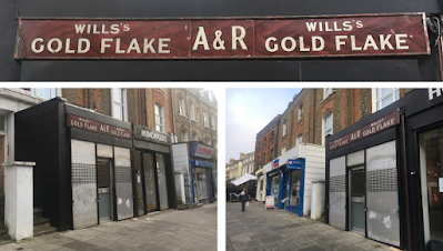
Earlier this year, as I was exiting the Post Office at Hornsey Road, I spotted a lovely old shop fascia across the road at No.526, advertising Wills's Gold Flake.

I crossed the street to take a closer look. It's in fantastic condition, so I wondered if it was an old sign that has simply been protected by subsequent layers or a modern pastiche. I took some snaps with the idea to do a bit of sleuthing.

Passing again a few weeks later, the door was open and I saw a fella working inside. He came out to chat to me and told me that he/they had found the sign under the modern one here whilst pulling apart the layers of adaptions during renovations and they fully intend to keep the sign. How lovely. We talked about the tobacco brand and how lovely the sign was but I completely forgot to ask his mname or enquire what kind of shop this will be. I will update this when I do know.

So who/what was A&R?  This could be the name of the people at this location, or a chain/franchise. The old street directories show that this was a greengrocer's shop in the early part of the C20th, run by Daniel Arthur Colby until 1914. The shop was ten empty for some time during WWI because nothing is listed for the period 1915-19 and I have no refernece beyond that. But I suspect the shop became a tobacconist in the mid-1920s. I can confirm, however, that by 1939 it is the business Mr. Herbert John Ranson who could quite possibly be the 'R' of A&R.

It's great to see this area of N19 finally evolving. As someone who has lived near here for over 30 years I have seen the shops become neglected in this island twixt Archway, Crouch End, Finsbury Park and Holloway. Hence there are quite a few interesting old bits of signage to be found herea and it's great to see so many new finds being preserved. For instance, across the road from this Wills's sign there is the old Hancock/Plumb butcher's shop that I have written about here. Further down the hill, south of Hanley Road, there is this old grocer's sign advertising tea at the rear as well as many more hints of the past here.

14 January 2022

Please help to save the unusual 'Art Deco' style façade of Willen House, Bath Street

If you have been on my 'Art Deco Shoreditch' walking tour you will know that a popular and provocative stop along the route is Willen House at 8-26, Bath St, London EC1V 9DX. 

It is such an unusual building because it looks to be 1930s, yet it was constructed soon after WWII, opening in December 1948 as shown within a plaque on the Lever Street corner. For the past few decades the building has been student accommodation and has suffered from a lack of care, the secondary double-glazing being particularly shabby.

Earlier this month, whilst out walking with some like-minded friends, I noticed seven information sheets in the windows of Willen House to the left of the main Bath Street entrance outlining tp bennett LLP's proposed changes for an upgrade to the building. Keen to keep up with my friends, I took some quick phone snaps so that I could read the info at a later date. And a good job I did that otherwise I would have been moaning about it for the rest of that day. The planned changes will effectively make it look like a new structure rather than a carefully-restored and adapted building. To say I am disappointed is an understatement. 

Having checked the 'work' section of tp bennett's website I can find no mention of this project to provide a link for you, so I have included my photos of the info sheets below (scroll down to the end) which, incidentally, were affixed L-R in reverse order which is itself sloppy.

I can also find no reference of these proposals on Buildington, which suggests to me that this is considered a cosmetic change, being that planning permission might not be needed here.

I have written a letter of complaint to the architects (see below) which I have cc'd to other parties who I think should be alerted to this insensitive shambles. 

Please note that it is the original exterior of the building that is worth saving here due to the quality of the products used. The interior was merely open spaces used as offices, storage and showrooms and, as such, would not have been in any way as impressive as the street-facing elements apart from, perhaps, the managing director's office which might have had some of-the-period interior design, but this would surely have been removed or altered when the building was converted for use a student accommodation. 

If you are also concerned about these proposals, please do write a letter of complaint yourself and make this issue known to any other parties you think could assist in preserving this unique and unusual building. 

For an idea of how the grey-washing of this will look, see what has happened to nearby Gilray House

..........................................

tp bennett LLP
One America Street
London SE1 0NE
willenhouse@tpbennett.com
Date: 12th January 2022
Re: Willen House Consultation / Revamp of Willen House, 8-26, Bath St, London EC1V 9DX 

I lead guided walks across London and have a keen interest in architecture, especially the ‘Art Deco' era. One of the most popular stops along my Shoreditch and Finsbury route has always been Willen House, especially when I explain to the group that this is not a 1930s building; that it was actually constructed just a few years after WWII and is therefore very unusual, not only for its lovely warm tones and quality of products used, but also because very few buildings were built at this time and certainly not to this excellent standard using quality products.
Earlier this month, whilst walking past the building, I noticed in the windows some information sheets that illustrate how tp bennett, a company who I have until this point respected and promoted, in the main for the excellent work created and overseen by Thomas Bennett back in the 1930s (such as, for instance, well-designed residential blocks in St John’s Wood and Westminster), is here planning to disguise almost all the original features which make Willen House so special and worthy of preservation.
Willen House is very unusual. There were only a handful of buildings constructed in the 1940s in London. This building has distinct ‘Art Deco’ styling yet, as the plaque on the Lever Street corner shows, it was completed in 1948 and opened on 7th December by W. Barrie, J. P., the then Mayor of Finsbury, hinting at how important an achievement this was to the borough and to the Willen Key Company at that time.
I have long been of the opinion that the Willien Key Company, which was founded in Battersea by James Walker in 1903, and moved to this area in 1923, had already planned and prepared for this building just prior to WWII, hence the quality of the products which would have been sourced or produced beforehand and the speed with which they were able to construct showroom, offices and warehouse. With much of the area devasted by bombs, the company, with their well-made locks and other property protection devices, would have been a business that was much-needed post-war, the products needed to secure homes and businesses in the surrounding area, indeed beyond.
The fabric of the building has indeed suffered since the Willen Key Company moved out and certainly now needs some attention, especially the interior, the windows, and rear of the building. However, the Bath Street façade with its tiled elements surely just need a good clean up. The tiles are now almost 75 years old and have stood the test of time well. The soft warm tone of the building is both delightful and unusual.
What appears to be proposed here is that the Bath Street façade is to be re-modelled and re-coloured to better tie in with the products used for the new build at the rear, effectively adapting the old to visually match modern cheap-to-install products, rather than making the new additions tie in with the quality and colour of the existing structure.
I am appalled and very disappointed to see that the plan is to cover, and therefore eradicate, the lovely warm beige tones that evoke a Mediterranean sunset, as well as the soft fluted tiles and the unusual chocolate brown double-stripe detail that frames those areas, in dull shades of monochrome that will over time become even more grey and dull, especially on dark or cooler days.
The integrity of Willen’s original building will be lost of these changes are implemented. A reference is made to the changes being “a nod to the past” and that the aim is “to refresh and enhance” yet it is evident that what we see here, is not a sympathetic renovation but a complete makeover that will make the building look like a pastiche of the streamline-moderne, such as in nearby Bunhill Row.
I have been advised that the proposed renovation has an approximate life of 10 years and that pale-coloured renders on north/east-facing walls are prone to patches of green mould during the first winter, producing an on-going suede effect. Application of this unnecessary coating will require damaging the surface of the tiles to make a key, whether by sand-blasting or abrasion, thus ruining them forever. This is irresponsible and far from eco-friendly in many respects. We need only to look many reclaimed pub and shop façades to clearly see how the scars made by paint application and its subsequent indelicate removal processes have caused irreparable damage.
As regards changes, additions and renovations to the rest of the Willen building, I agree that the windows are indeed in need of replacement. However, there are many good quality double-glazed units available these days with fine, thin, profiles/frames, both Crittall-style metal or UPV.
I am keen to know if the plaque on the Lever Street corner will be retained in these renovation plans, as surely it should be. A similar unsympathetic ‘white-washing’ of the past can be found in nearby City Road where Buckley Gray Yeoman’s external renovation of The Epworth Press building uses a too-bright iridescent white coating over the original soft ivory/natural-coloured faience tiles. It is ironic here that the iridescence does not sit well with the natural colour employed by the architects for the additional upper floors.
Conversely, for a reference of how renovations of this kind can be sympathetically achieved, please see this example at The Drapery, by Brooks Murray Architects where a once messy site has been cleverly adapted and repurposed to marvellous effect.
I look forward to your reply, or at least an acknowledgment of this letter

Jane Parker / www.janeslondonwalks.com / jane@janeslondon.com / @janeslondon

I had no idea 'materiality' was a word until I read this – try saying it out loud – it's almost impossible!

30 December 2021

Clapton ghostsigns – hints of upwardly-mobile Victorians and a multi-layered engma

I've been wandering the streets a lot these past few weeks. Either just following my nose, investigating places I don't know so well, or planning walking routes for the future.

I was recently near the River Lea in the in Clapton area and thought I'd best go and check on a couple of old bits of signage near the main drag to see if they were still there. And indeed there were/are.

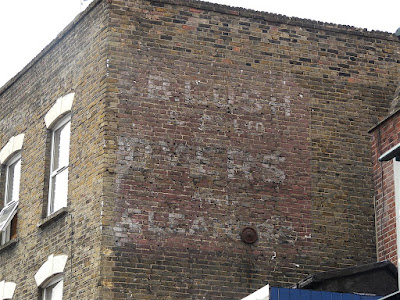
Just east of the roundabout on the north-facing wall of 203 Lower Clapton Road, today a Ladbrokes betting shop, there is this a hand-painted sign for S. B. LUSH & Co. Ltd, dyers & cleaners, rendered in white 3-D effect block letters on a red panel. If we look back to 2008 we can see that it's in reasonable condition because it was, up until then, covered/protected by a boxed sign.

A bit of sleuthing shows that 'Lush & Cook, dyers' were here from at least 1896 until the first few years of the 1900s and by 1901 the name had changed to become 'S. B. Lush & Co' – I wonder what happened to Mr Cook? So far I have not managed to ascertain if Messrs Lush and Cook were here pre-1896 but I have found evidence of S.B Lush & Co at some very well-to-do locations in central and NW London. For instance, in 1891 the man/company was at 6 Wigmore Street, W1, and also at 1 Motcomb Street, W1, 38 Ladbroke Grove and 105 St John's Wood Terrace – so this really gives us a sense of how upwardly moblie this area of Hackney was at the end of the 19th century. The company had gone form here by 1904 when this became the premises of a milliner, followed the following year by a piano maker. For the period 1908-14, it was a confectioners, owned by a Mr. Thomas Taylor. So now I'm asking, what happed to Mr. Lush?

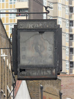
I continued my walk southwards to the corner of Downs Road where I was surprised and rather pleased to see that the filthy broken 'Art Deco' era clock for Strange Chemist is still hanging in there above today's pharmacy which still bears the same name as it did in 1939. They really ought to, at least, give this old timepiece a clean-up. 

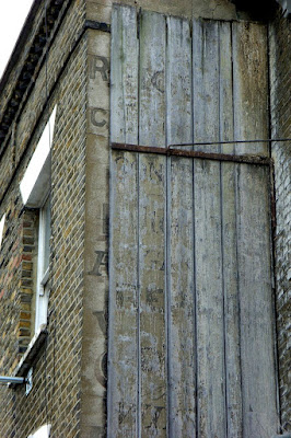
Then round into Downs Road, and immediately left into Clarence Road. On the right hand side, a little way along, on the side of No.163, there is a double-layered sign. I stood looking at it, amazed that it was still intact, albeit faded. It appears that over a century ago, a hand-painted sign on the wall was covered with wooden planks that were used as the basis for a secondary sign. The wood is held in place by an angled arm of metal. It's hard to believe how this structure is still there!


The wooden sign is very bleached and faded today and there is barely any paint left, but my pic here from July 2008 shows how the letters on the boards were almost discernible and would have been even clearer had I vistied it a decade previously. I think I can make out the word 'dealer' two-thirds of the way down here. As for the sign underneath, the tantalising letters peeking out at the left hand side of the boards, give little away but there's a letter R at the top, so my guess is that the sign could be for Miss Ann Reynolds, haberdasher, who was there in 1901, and/or William Richardson, builder who was listed as being next door at No.165 in 1914.  

This is so bizarre enigma, don't you think? Just what was the though process here? Was the second sign menats to be temporary? Because, surely it would have been easier to whitewash the first sign and then over-paint it. Does anyone have any other ideas?

Please do let me know if you have any further info on any of these..

26 December 2021

Hendon ghostsigns

In my previous post I wrote about a drive about in London on Christmas Day which somehow included a jaunt up the A5 to Colindale. On the way back we stoppped along Hendon Broadway to check on a few ghostsigns. The street has a sense of Victorian-into-Edwardian faded glory. The last time I had a good wander about there was 2011 and I was keen to see how many of the signs I'd seen back then were still visible today.

The first old hand-painted sign that looms into view on the left as you head northwards, above what is now Aladin's Kebabs at No.147-9, is a sign for George Frederick Kruse. Left of the window it's easy to make out 'Estate Agent' in angled Coca-Cola-esque script complete with what I call an underswoosh. Above that, to the extreme right, immediately above the horizontal bar between the windows, there are remnants of some lettering that I think includes '[Local?] & Adjacent Districts' and 'APPLY' which could be followed with 'within' as has been suggested, but I am not so sure about that seeing as the much easier to decipher section below directs us to another address:
GEO. F. KRUSE (in an arc) / 50(?) YEARS IN HENDON / AUCTIONEER & ESTATE / –> AGENTS <– / Opposite Hendon Statn. N.W.4 / PHONE HENDON 1115. / Management of Property a Speciality


The estate agent shop at 32 Station Road would have been directly opposite the Hendon railway station here – there is no number 32 there today and the postcode written on the sign is given as NW4 which is the eastern side of the tracks.

I did a quick bit of googling and discovered in the National Archives that during WW1, George, then living at just round the corner at 89 Audley Road, NW4, appealed for exclusion from National Service, claiming that 'serious hardship would ensue' due to his 'exceptional finance or business obligations' – I haven't pursued this any further as yet to see if he was successful. 

Just up the road from here, at No.163 on the north-facing side overlooking Milton Road, is another faded sign advertising dairy products. It's fairly obvious that the who wall was once slatered in lettering and there have been many over-paintings throughout the decades which are hard to decipher today. However, eleven years ago I could clearly see that the centre section read: "BARRIES / FOR PURE / MILK" – I haven't been able to ascertain if thtis was alocal company name or a product.

If you spin round from the Barries sign and look north along the same side of the road, you'll see at the side of No.177 there is a nice surprise – a boxed sign used to cover a large proportion of this wall and it has in the last few months been removed to reveal elements of a Gillette safety razor ad. there are also hints of other layers of signage here – a palimpsest of advertising on this south-facing side wall.
I think the very large red lettering is for DAILY MAIL and there are other panels of faded blues and reds. Black block lettering at low level reads 'FOR SALE' with a more friendly script in white behined or over the top of it.
How jolly intriguing and this must look fab on a sunny day with better light.


Further up the road there has been a fair bit of demoliton, rebuild and renovation since I was last there and this has meant the loss of two Co-operative Society signs. One used to be on the north-facing side of No.197 with a second, south-facing sign on No.201. The second one, shown last here, was a sign I particularly meant to return to another day when the light was better and I was armed with a good zoom lens, because it had lots of white block lettering at the top and, in a sort of script at the bottom, it read: '...other members'.
It's interesting that a Co-op grocery store today occupies the site.

For more research on all of these signs, indeed the changing face of this street, more info would require access to the old Middlesex directories or a visit to the Hendon archives. Any feedback welcome.  


25 December 2021

A Christmas Day drive round London.

Christmas Day 2021. 

With no Congestion Charge and no Ulez restrictions my mate Malcolm drove over to Holloway from Notting Hill to pick me up at 9:30am. No plan. Just drive about wherever.  

From Holloway we went straight  down an almost empty Cally Rd then passed Kings Cross, St Pancras and Euston railway stations, before heading down to Regent Street and round the three sides of Trafalgar Square, along Strand, round Aldwych and along Fleet St, though the City and into Whitechapel. A right turn at Mile End, down to Stepney and through the Rotherhithe Tunnel to Bermondsey. Then the first of many bridges... over Tower Bridge, down along Lower Thames St before heading back south via Southwark Bridge. A peek at the vast hole where the Elephant & Castle shopping centre used to be then across Lambeth Bridge, along Millbank past TateModern and over Vauxhall Bridge. Then along Albert Embankment, over Westminster Bridge, round Parliament Sq, up Whitehall to Traf Sq, into The Mall, stopping to watch some mounted guards, down Birdcage Walk to Buck Hse and back again along St James Pk to Westminster, along Victoria Embankment, up Northumberland Ave to Pall Mall, along Piccadilly to Knightsbridge and into KenGdns/HydePk opposite the Albert Hall where we parked the car and got out to look at the views across the Long Water and The Serpentine. But it was freezing cold out there, so back into the car...

Exited the park at Lancaster Gate. Investigated streets and mews nearby before heading up Edgware Rd and following Watling Street, the old Roman rd, through Maida Vale, Kilburn and Cricklewood where we looked at old signs and railway cottages, and then across the A406 North Circular Rd, to West Hendon to check up on a few more ghost signs. For some reason, perhaps unable to decide left or right, we continued northwest into Colindale where we stopped for Christmas Day lunch at a KFC. 
Warmed by spicy chicken baps, chips and alcohol-free hot drinks, all of which we were pleasantly surprised by seeing as neither of us had eaten the Colonel's fare in a decade or so, we rejoined the North Circular and travelled clockwise to investigate Hampstead Garden Suburb, wondering how people who live there cope being so far from a pint of milk. And then back to Holloway via Highgate Village. A lovely way to spend the daylight hours. But it’s also nice to be back indoors cosy and warm. 
 
Tomorrow I will post about the ghostsigns I snapped today. 
Ding dong merrily, whatever rocks your Christmas boat, Jane

10 December 2021

The Trafalgar Square Christmas tree – thank you for being thankful, Norway

For the last few years, and especially so this year, I have been appalled to hear that people have been complaining that the wonderful Christmas tree in Trafalgar Square is "too sparse". Well, what a slap in the face for the Norwegians who have been sending a tree to us for over seventy years. I am glad to see that they won't be organising a replacement. See The Metro, 9Dec2021, right.

It's really ungrateful. This is not just a simple case of 'where's the receipt, can I get my money back?' and I suspect that most of these complainers have no idea the meaning, the effort and generosity behind this installation.

Since 1947, Norway has been donating a prime Norweigian Spruce, at least 20 metres high, to adorn our famous square, chosen by representatives of Oslo and Westminster from their lush forests. It is gifted to us as a thank you for assisiting them during WW2. The who process is a big logistics exercise, felling the tree and transporting it safely across land and sea. That's over seven decades of 'thank you's.

Once safely installed, the tree-lighting ceremony takes place at 6pm on the first Thursday of December every year (exc last year due to Covid-19 restrictions). There are speeches from Westminster council dignitairies and the Mayor of Oslo who last week was patently so delighted to be back in London again switching on the lights. I was there. Here's the before and after... 5, 4, 3, 2, 1...

I wonder how many of the complainers were in the square that evening, enjoying this short but sweet ceremony and singing along with 'Once in Royal David's City'? I expect none. 

The tree is not sparse. In fact, it's an excellent example of its species. It's a fashion thing – people these days seem to want what I have heard on TV called "the traditional Christmas tree look" and by this they mean those dense little shrubby bushes, or the plastic equivalents. But this confuses me as surely a 'traditional' tree, from the Dickensian era, would be like the one set up by Victoria and Albert in 1841, right, with open branches, better to see all the pretty adorments.

I have also heard people complaining about the lights on the Trafalgar Square tree, how they are also disappointingly sparse. Well, dear people, they are hung in a traditional Norwegian fashion, with 14 strands falling from the top and I, for one, like how those strands fall nestle within the branches.

Thank you Norway. Some of us here don't look a gift horse in the mouth.


30 November 2021

I was born in the 1900s

What is this thing lately where people refer to periods of history as "in the 1600s"? Is this yet another example of dumbing down, for people who don't understand "in the 17th century"?* I am even hearing those presenters on the BBC antiques programmes using this, even Susie Dent on Countdown when she talks about etymology

Let me explain... Often, whilst watching a TV programme or reading a book, I see/hear a sentence akin to "the mid-1800s was a busy time for industry" so I expect to hear about the late Georgian innovations, the Regent's Canal, etc. But then they start talking about the railways and the Great Exhibition and I realise they mean the middle of the 19th century, the mid-1850s, the Victorian era. 

Similarly, "in the late 1600s" is really confusing – this could now have two meanings. It could be alluding to either the first or the last decade of that century! It's extremely frustrating and confusing, and creates a situation where information might be incorrectly shared because the terminology is vague. I have even heard presenters on TV programmes using both styles within a five minute timeframe. Eh? What? When?!

Dates stamps on buildings, from the 1800s 1900s (ha ha). This collection of images originally appeared in Dec 2011

However, whilst this new cover-all century-wide style seems to be becoming commonplace when referring to the dim distant past, I notice it is not being applied to recent history. A comparison I use to try to put a halt this silliness, is to point out to my contemporaries that we must have all been born in the 1900s (er, the Edwardian era)!

Oh, and don't get me started about the insertion of rogue apostrophes/possessives such as "Jane was born in the 1960's. No no no!!!  To clarify: the 1960s is an era (plural), Jane is wearing a 1960's dress (of that era/possessive).  I hope that helps, ha ha.

*perhaps this is for people who also cannot read a map, who don't understand where north is and how once you know that and have established a simple point of reference the rest is easy.

14 November 2021

Summer Show 2021 and Late Constable at the Royal Academy

I've seen a lot of art these past few weeks. And it's all good.

Last week I went to the Royal Academy Summer Show which this year is not restricted to a few weeks in the summer . It's a riot of colour and sort of reflects all the street art and road crossings that are brightening up the City at the moment.* I also like that this year's show has a greater percentage of textured, textural, handmade pieces such as collages and interesting things made out of found, recycled or collected objects. 

So absorbed was I that I only took a few photos and these include, top left, a sculpture by an artist friend, Jaana Fowler. I couldn't take a snap of my mate Johnny Bull's framed print because it was set so high on the wall – hey JB; well done re all those red dots!

And so to the small, but very absorbing, Late Constable exhibition at the RA which I visited on the same day as the Ron Mueck show in nearby Dover Street,

This interested me because I really like John Constable's sketches and preliminary work, more than I do his finished paintings which I often find a bit over-egged, chocolate boxy and twee. This show has some marvellous before and after comparisons (guess which ones I like best!) and lots of his weather studies – rainbows, storms, clouds etc, which reminded me of my A-Level art years when I was trying myself to master a decent cloud-painting technique, with an idea to produce an indulating old-style rollercoster (man made) against a backdrop of cumulonimbus (nature). I never quite got the hang of the clouds and I sort of gave up. Instead I made a simple graduation in the background that I wan't really pleased with. I must have dumped the lot or left it all in the plans chest there because, having just looked through my 6th form sketchbooks and other works I have saved from that era, I can't find any ref of that at all, and I now wish I'd been able to view Constable's efforts when I was a teenager to see how he too struggled to capture the ever-changing Great British sky.

It wasn't just the paintings and sketches that intigued me. We were at first perplexed by the studs and sliders on some of the frame (top right, above), something that we'd never noticed before but surely must be reasonably commonplace. We decided the sliders must be the closing mechanisms and the studs must be little handles to enable the front section, including the glass, to be flipped forward to allow the canvas to be loaded from the front, rather than from the rear which how modern frames are constructed. Please correct me if you know better.

There's plenty of time to see both exhibitions – The Summer Show runs until 2nd January 2022 and  Late Constable until 13th February – both ticketed. However, there are galleries and exhibitions at the RA that are free and well worth a visit. I'd particularly recommend the Collections Gallery on the first floor at the rear (easier via the Burlington Gdns entrance) where there are some marvellous artworks. Also, in the low level linking corridor adjacent to the toilets and lovely cafe, there are some absoultely stunning pieces of sculpture. Find out what's on at the RA here.

*Tbh, I'm not eally keen on those colourful crossings – the ones outside the RA along Piccadilly are looking really mucky these days. There's a good reason roads are a grey colour!

11 November 2021

For the search function please view the web version

Ron Mueck at the Thaddaeus Ropac Gallery – Wow in all respects

I had no idea about this superb gallery until I walked inside the door of this unassuming, yet beautifully renovated, Georgian house in Dover Street earlier this week. My friend and I had gone there to see the impressively realistic sculptures created by Ron Mueck and neither of us were ready for the place to be, what has been quoted as, possibly the loveliest gallery in London. 

As we entered Thaddaeus Ropac's gallery we were immediately impressed by the gorgeous wide hallway that leads through to a large room at rear of the building where three of Mr Mueck's pieces are displayed, a room I assume was once used for soirees, dancing or entertainment. Above the receptionist's desk in the hallway there is a gorgeous lightwell in the ceiling that offers tempting views of the floors above and I imagined young ladies looking down dressed in ballgowns, giggling as their party guests arrived.

Ron Mueck's pieces arranged over the ground and first floor, accessed by a superb marble staircase. His works are always oversized or undersized, never lifesize, and I find them absolutely fascinating, which is odd because I am not a fan of photo-realistic paintings. Perhaps it's the scale thing. This exhibition is a selection of 25 years' work and I distinctly recall my sense of awe the first time I saw Dead Dad at the Sensation exhibition and his overly-large Crouching Boy within the Body Zone at the Millennium Dome, in 2000. 

Another bonus – a room immediately to the left of the front door contains a small Marcel Duchamp exhibition – oh what a provocative naughty boundary-pushing man he was!

Everything about this gallery is worth going to see. Oh, and it's free. What's not to like?!