Showing posts with label galleries and museums. Show all posts

20 April 2026

The Society of Portrait Sculptors' fab selling exhibition FACE2026 at The Garrison Chapel

The Garrison Chapel is a Grade II listed 1852 church nestled between Pimlico Road and Chelsea Barracks. No longer a working church – it has been converted into an exhibition space for The King's Foundation. The exterior spaces around the chapel have been recently renovated and remodelled – the whole area is well worth a visit.


The current show is Face2026 – ends 26th April – however, the guy on the desk told me when I was there on Saturday that there was still fortnight to go. Hmm. You'll need to double-check that. 

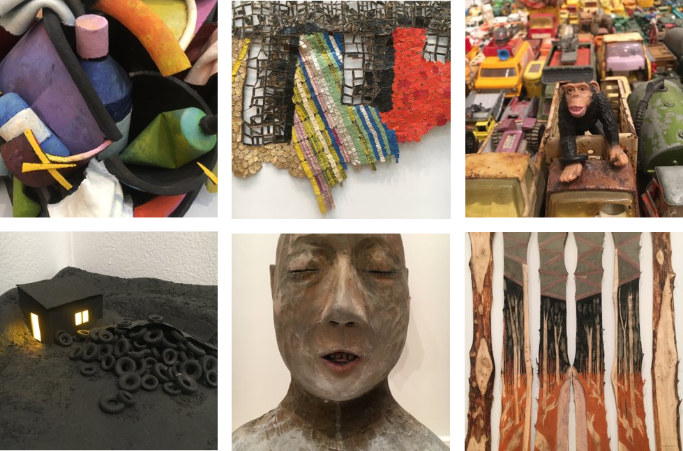
Here are some pics showcasing a diversity of mediums.

Yes, that's Maggi Hambling, looking very much like her own work, specifically her Oscar Wilde memorial behind St Martin in the Fields church
 
Nice to see some smiling faces for a change.
I particularly admired some of the wood carvings, especially top right above (Albert Kozak) and top right below (
Jared Bartz), the latter carved with a chainsaw(!) – I happened to meet and speak to Jared who was also visiting on Saturday.


I also really liked a group of twelve small pieces comprising one work by Aleksandra Mazurkiewicz, shown above bottom left next to two close ups which highlight the texture and textiles applied here. I think they probably echo the Stations Of The Cross. The small semi-concealed face was possibly my favourite piece in the whole exhibition. 

5 November 2025

Painting Light – Anna Ancher at Dulwich Picture Gallery

The curators at Dulwich Picture Gallery have done it again!  They've pulled together yet another fabulous collection of artworks by yet another artist who often goes under the radar here in the UK.


This time we have Anna Ancher (pronounced Anker), a talented lady based in the small town of Skagen in Skane, which rhymes with Jane and window pane, and it's the latter which features in many of Anna's painted works as she was very adept at painting light coming into interior spaces, mostly within her family home, Brøndums Hotel, which formed the hub of the town at the very northern pointy tip of Denmark.

This reminds me of art classes at school, approx age 15, when we were tasked to paint an interior with light coming in from a window ahead. Weirdly, we were expected to do this from our imagination, not from life. I will dig out my old portfolio later this week and I might add pics of my efforts.

Many of Anna Ancher's evocative paintings feature her friends and family busy at work or just sitting and reading. I relate to the quote about about staying close to home, something I tend to do more these days as I haven't been anywhere that involves a plane journey for almost eight years. Recollections of places visited in far off countries fade over time and become almost dreamlike memories. There is so much to see and do nearer home. However, my home town of London is vast and varied and there is always something new to experience, as Samuel Johnson observed in that 'tired' quote.

Note that I have cropped into most of the paintings to select specific details.

Anna was well-known in Denmark, yet I had never heard of her before being alerted to this show, and I doubt many others will be aware of her either unless they have Danish friends or connections to that country. I'm often saying that there are many talented artists all around the world whom we never get to hear about, in countries as random as Venezuela and Vietnam, yet all we are mostly fed on Monet, Van Gogh, Picasso and The Mona Lisa!


The Skagen landscape features in many of Anna's works, again with the emphasis on natural light at different times of the day, the narrow flat peninsula providing both sunrise and sunset opportunities.

If you visit, be sure to watch the short movie in the central area and look out for the little doors placed here and there, cleverly designed to intrigue and inspire children (and me):


If you saw my RA Summer Show entry earlier this year you will already know that I am interested in the gallery walls as well as what's on them, so I've here grouped these little doors with other things that caught my eye – a painted grille, two big studded doors and the end of seating over a trap door.

19 August 2025

It was great to be part of the RA Summer Show 2025

This year's Summer Show at the Royal Academy closed its doors for the final time on the afternoon of Sunday 17th August. 

I was very chuffed to have my work 'Strictly Forbidden' selected for Room III, the largest space where they serve the drinks, and placed adjacent to many well-known Royal Academicians including Cornelia Parker who I met on Varnishing Day, 9th June. Hmmm... Parker. I wonder if we are both somehow related to Spiderman and Lady Penelope's chauffeur?


My work was a framed print of a part of one of archways that connects two of the rooms. It was lovely to hear all the positive feedback from friends and associates who either hunted for it having heard that it was there, or happened upon it by surprise. The whole experience has been a delight. 

The Summer Show was marvellously eclectic this year with different types of work intermingled, such that architectural models sat alongside abstract paintings and wooden mobiles were suspended above photographic prints. 

I visited he show eight or nine times and every time I found works that I was convinced weren't there before – it's so hard to take in more than 1750 artworks in one visit. Here are just some of the things that caught my eye:

7 May 2025

Kensington Gore – hot and cold and nine miles from Hounslow

Lowther Lodge, is a lovely GII* red brick building at 1 Kensington Gore, facing Hyde Park and Kensington Gardens as seen here. The house was built in the 1870s for William Lowther, MP, designed by architect Richard Norman Shaw who is also responsible for the Bedford Park Estate adjacent to Turnham Green. 

In 1912, Lowther Lodge was sold to the Royal Geographical Society and, over subsequent decades, the property was extended to include a library, a lecture theatre, offices and other facilities. One distinctive addition is the hall/meeting room at the junction with the Exhibition Road which is adorned with many things that please me – a distance marker, a bench mark, two statues and some street names.  

First, the white metal sign, dated 1911, showing the distances East to Hyde Park Corner and West to Hounslow. This has always intrigued me because I doubted that Hyde Park was a full mile away, but having now checked using my trusty string and wall map I can confirm it as a fact. Similarly, the marker that sits further up the road outside The Milestone Hotel is definitely half a mile away. 

This heavy metal information post is quite amusing as regards its details which have been crudely enhanced in black paint, making the lion and the unicorn appear as comedy cartoon characters and the manicules look more like random blobs rather than elegant pointing hands.

Marks on the bricks indicate that it used to be attached to the wall. Indeed, the oblique view confirms that there is a 4"/10cm gap. 

To the right of the mile-marker (surely it's not a milestone if it's not made of stone?) there is a little vertical rectangle of verdigri'd metal. Look closely and see "OS, BM, 0931, S" and a 3-line motif:

This is an Ordinance Survey Bench Mark used by surveyors to calculate heights above sea level. More about these here

On the other side of the mile-marker there looms a marvellous statue of David Livingstone, explorer, missionary, writer and medic:

This is the work of Thomas Bayliss Huxley-Jones, a prolific and popular artist whose work adorns many public places in London, including the Joy of Life fountain across the road within Hyde Park. 

Mr Livingstone was unveiled on 23rd October 1953. It 'pairs' with the earlier statue of Sir Ernest Shackleton that was installed in 1932 on the East side of the building in Exhibition Road: 

Shackleton, complete with thick fluffy boots and mittens, is the work of Charles Sarjeant Jagger whose most famous work is probably the Royal Artillery Memorial (1935) at Hyde Park Corner (which we know is one mile away!).

Finally, the lovely carved street signs – I wonder if these also came from Jagger's studio:


I'm told that London cabbies call this location 'Hot & Cold' due to the climates that these two intrepid gentlemen explored..!


12 October 2023

Fashion City at Museum of London Docklands – How Jewish Londoners shaped global style

There is a marvellous exhibition at MoLD about the world of fashion and tailoring, couture and the Swinging Sixties. This museum, within an old warehouse that abuts one of the docks is somewhere you'd usually go to find out about the history of shipping and trade in this area, and fascinating it is too, told chronologically within the upper floors of the building.

Yet this latest exhibition about the garment making industry. It fills the ground floor space previously occupied by their marvellous Executions show, and it is certainly up to that same high standard – packed full of information about the innovative and skilful tailors, designers and makers who created beautiful clothing and accessories adjacent to this part of the River Thames.

One only has to walk around the nearby Spitalfields area to get a sense of the clothing-related trades that once thrived in the area. I noticed whilst researching my ghostsigns and Art Deco walks that many of its streets, such as Hanbury Street and Fournier Street, were in the 1880s occupied by tailors, trimmers, furriers, outfitters, hatters, leatherworkers etc, and approximately 80% of them listed with Jewish names. 

1940s: Monica coat by Koupy / 1970s: bra by M&S / 1960s: shirt by Mr Fish

This engaging exhibition echoes that manufacturing history and, just like the main museum, it is a chronological journey, starting with the Jewish immigrants as they arrived via boat, seeing how and where they lived and were schooled, with rooms laid out as evocations of shops and a tailor's workshop. The East End is then linked to Bond Street via Central Line corridor, the construction of that tube line better enabling these talented people to get their wares to West End. 

There are some beautiful handmade pieces on show both by unknown tailors and by well-known names such Cecil Gee, Chelsea Girl, Moss Bros, M&S, Mr Fish, Irvine Sellars and David Sassoon. Plus lovely leather luggage, some fabulous hats by Otto Lucas, and a stunning wedding dress by Neymar (Netty Spiegel). There are references to, and examples of, clothing worn by celebrities from the worlds of film, music, sport and royalty, as well as actual garments worn by Princess Diana and Dot Cotton. Oh, and the music and soundtracks in every room is cleverly designed to echo each era or district. 

It's really very good. I was so engrossed that I spent many hours in there reading every panel and assessing every sequin such that I forgot to take any more pics than the three shown above. I do love a well-made fitted coat, especially a red one, the bra with its interchangeable straps and evocative lace pattern reminded me of my mum, and I was blown away by the teeny tiny stitching on that Mr Fish shirt!

Museum of London Docklands (free)
This exhibition – 13th October until 7th July 2024 – Various prices – find out more here


30 June 2023

After Impressionism: Inventing Modern Art at The National Gallery – ooh lovely!!

Oh my, this is good. What a lovely surprise – an absolute delight.

Just like my last post about the Ai WeiWei show, I had no idea about the content here until I entered the show. Immediately I saw some fabulous works of art, many of which I knew and had seen before elsewhere, others I had seen only in print or online, and quite a lot of pieces that I had never seen or heard of before. Breathe, breathe.

It's bloody good. It's got works by all the faves, Klimt, Van Gogh, Cezanne, Degas, Mondriaan (yes, I did spell that correctly), Seurat, Gaugin, Picasso, Matisse, et al, including many pieces new to me being as they are from private collections, the like of which we might never see again. Ooh. Lovely.   


I've put together a few details here – perhaps this could be a quiz – can you recognise the artists and/or the works? 

I have been told that many critics gave bad reviews about this show... Eh? Were those critics blind or lazy? Have they actually been to the show? Or, as I see often, did they copy and paste from one idiot's experience at a packed preview where the works cannot be seen due to the amount of people blocking the view? 

It's on until 13th August. Ignore the critics. Make up your own mind. Just show up, buy a ticket and walk in. I'm hoping my pics are temptation enough, but if you really need more info, click here.  

I might go a second time. Did I say I liked this?! 

29 June 2023

Making Sense of Ai Weiwei at The Design Museum – wonderfully evocative

I went to see this show on a whim, it was a sort of an unplanned visit being as the Design Museum was a convenient place to meet my friend. Immediately as we entered the space we said "wow!" out loud. Both of us are into collections, patterns, history references, etc, and this show brings together all of that and more.

Ai Weiwei has been through so much in his life and this show brings together much of his hard fought experiences, making beautiful arrangements out of thought-provoking remnants and broken parts, and new pieces inspired by his time in incarceration. 

We were especially intrigued as to how the many thousands of elements were placed. For instance, if this show moves to another location, will the many individual fragments be arranged in exactly in the same configuration?  To this end, I took photos of some of the corners of the displays so that we might be able to compare them with any future shows. 

The idea of exact replication would be a major undertaking, but we think it might be the case, especially in the case of the arrangement of little porcelain balls which clearly has specific areas of different coloured clay within the smaller size, something we decided was intentional. There's also a pattern within the layout, like arrangements of fans. 

Lego bricks also feature, recreating Monet's Water Lilies with the addition of portal to a hidden bunker. It's a mesmerising and thought-provoking show in many ways. 

The show is on until 30th July – more info here – though I always say, don't look at pics of things before you go to see things – just get a hint of it and get the 'hit' of the new when you get there, just as we did. 

In amongst AW's political, historical, topographical and social observations, I learned that there are two types of woodworking in China – furniture making and house building are called 'small carpentry' and 'large carpentry'. How nice. Many of the arrangements at the show gave me the urge to get creative with a needle and thread or to rearrange my own collections, especially my clay pipe fragments, something I have been meaning to return to as an art project rather than just a jewellery outlet.

10 June 2022

The [marvellous] World of Stonehenge at The British Museum– until 17th July 2022 (and a tirade about the V&A's awful Fabergé show)

I am a bit late behind here – I went to see this marvellous British Museum exhibition back in March and I really thought I'd posted about it, especially as I enjoyed it so much, in many different ways.

First of all, this is not an exhibition about Stonehenge itself, nor is it aboout the other Europens sites mentioned in the blurbs. It's actually about the many beautiful items that were being created at the same time the stones were erected. I must admit that I had glossed over that myself when I bought the tickets (I don't like to be laden with preconceptions) and I am so glad I did that, because the surprise at seeing so any intricately-created pieces really did impress me. I had lots of conversations with other attendees there and we were all in a sense of awe. The gold pieces, in particular, were a revelation to me.

Despite being aware that other ancient civilzations, such as in Egypt, were capable of such fine work, I had never before really considered that the same was happening here. This meant that after seeing the show I went to look at other relevant exhibits in the main museum, specificlly intrigued by the gold torques (collared necklaces).

One display at this the show is a collection of carved spheres, each the size of a cricket ball and all different. An accompanying info panel tells us that it has not been ascertained as to what these were created for, or why. They all have intertwined geometric patterns, circular motifs or textured grids on them.


A man at my side was also intrigued by these orbs and we tried to come up with some ideas of our own. I queried why there needed to have a purpose at all and perhaps they were merely decorative. Consider in the future, what will people think of the pointless items of today such as figurines, ornaments, snow domes, nodding dogs, even Rubik cubes and acrylic fingernails? Perhaps these stone balls were simply something to make whilst chatting with the family after dinner or around the fire in the evening, or the crafters were simply honing their skills or testing out new designs and patterns for use on other larger projects. Could they even be the equivalent of a sample set, like a 3D swatch book? Or were they apprentice pieces like those made more recently in the cabinet making and tailoring trades?

We also liked the cases and cabinets that hold the exhibits here – everything is beautifully and clearly displayed within cleverly-constructed thick basic chip board, painted in colours that evoke stone, slate, wood etc, with all the edges rounded and smooth. 

There's lots more to see than gold and balls... do go and check it oout... five weeks left. Tickets here

From the sublimely simple and effective to the ill-achived mess that was the Fabergé exhibition at the V&A – dreadful and disappointing, on so many levels. 

This exhibition ended in May. First of all, you couldn't take photos. Well, that's OK but how can you see the teensy weensy workmanship? I often take a snap of small things at museums simply to be able to zoom in for a better view. And, surely, it's the detail in Fabergé pieces that's the most impressive thing?  This might have been assuaged had the pieces not been within cases that only alowed one or two people to view at a time (and here we are in a world of socal distancing!) and only one view possible, from the front. A few carefully positioned mirrors within those cabinets would have been helpful, to say the least. And they could have pasted large format macro shots of the jewelley on the walls or around the cabinets. Or at least supplied magnifying glasses as I have seen available at other museums and galleries. 

The design of the show looked cheap, as if each room had been given to a different first year interior design student as a project. On entering the show there were three big free-standing alcoves, the outer two with nothing in them at all, looking as if they were there for selfie opportinities. Oh, but, no; there was no photography allowed. The first exhibit next to the alcoves was an intricate Fabergé piece but with scant explanation and this threw up lots of questions but we couldn't find the answers, even when we realised that the introduction about the man himself was on a wall behind us, such that it is not visible as you enter. Then a queue to view tiny things in those aformentioned cabinets along a wall. This took ages and I gave up half way hoping that things would improve. Nope. 

Other rooms referred to places and people we had not been introduced to before and I kept going back to previous rooms to find info I might have missed only to return empty. We kept asking 'who?' 'what?' or 'where?' such as a big pic of a shop in part of a short movie that we later sussed by accident was Bond Street. To watch this movie involved standing where people were constantly walking past hindering the view, yet there were clear empty spaces in that room that could have been better adapted.

Only one room had an attempt at graphics on the walls, in the form of white lines on a green backround evoking diamonds, yet this was only in the corner of that room. And with no apparent specific relevanceto the pieces within those cabinets. Another room was shoddily 'decorated' with what looked like recycled props from a wedding or corporate event in the form of fake plants and trellis work. We could not understand twhat a garden had to do with it at all. Oh, and half way through the exhib, two parts of the building are linked by a utilitarian connecting tunnel/room that was painted black. Black like a cave. Talk about ugly. Surely something could have been done with this to make it feel part of the show?

The occasional info panels (A3 sheets pasted on the walls) also look to also have been designed by a novice. I have never seen such ugly misplaced typefaces. I managed to take a couple of cheeky photos even tho on the third attempt I was sternly told 'no photos' even tho I expained that I was snapping the info panels for typo reference, not the jewellery. What a jobsworth! As you can see here, one headline typeface is used here and there but not consistently (other signage had random horizontal rules above or below). Some wacky designer has created a font wherby all elements are the opposite of how they are in cuts of say Times Roman etc. Thicks replace thins and it makes for something that's really hard to read. Oh how radical. But why use it here? Also, a similar serif font is used for headings elsewhere, sometimes all caps, sometime U/lc, as per on the Acknowledgements boards near the exit. These two headline fonts are married with a horribly clunky sans serif for the body text that has clearly been designed for screen use. Bleargh! None of the typefaces used bear any relevance to, or enhance or complement the elegance of the high-end Fabergé brand. 

And then to the last room where Fabergé eggs were displayed in free-standing tall cabinets. Hurrah it was possiblt to walk around all four sides but still not possible to see anything up close and, as with the earlier rooms there was lots of whate space above and below ther glass where large format close-up images could have been installed. Little info panels told us about things inside the eggs that were not visible being as the item was closed. Aaargh. A simple bit of photographic reference would have helped.  The room was horrible, very high, and a strange makeshift-looking dropped ceiling had been installed making it feel like we were in someone's bad barn conversion. And finally, we were amazed to discover there was no shopping experience on exit. We had hoped to flick through some books, admire some Fabergé-inspired jewellery and perhaps buy something relevant like an egg-shaped fridge magnet (that's something I have invented right now). But no... into another dark corridor and out into the museum proper.  

If you missed the show, you didn't miss much at all. The pics and info on the V&A website here are much more informative

There's probably mistakes in this Fabergé rant. I wrote it as a stream of consciousness and I am not going back to edit/check it... If the V&A and Fabergé don't care about the details, then why should I?!!

9 June 2022

Cornelia Parker at Tate Britain, 2022

Yesterday I went to my favourite London art gallery, Tate Britain, to see the marvellous works by the wonderfully talented Cornelia Parker. This inspirational woman not only shares my surname but also seems to have similar internal questioning dialogue about the things around us and the patterns she sees on the streets around us. 

A few friends had been to the show already and I did my best to avoid their many photos on social media as I always prefer to see an exhibition/film/performance 'cold' with no preconceptions and that way I get a true reaction on seeing something for the first time, having not been discoloured or enticed by often misleading enthusiasm or criticism.

I said I wouldn't take photos myself, but I just couldn't help myself when I was there. These little 'Parker does Parker' shots are shown as snapped in square format and you might have already seen some of them on my janeslondon Instagram feed. I hope they intrigue and entice you. 

 Every room was full of clever ideas. And there were many other things I admired there, and the thoughts and ideas behind them too, each explained in print beside the work written by Cornelia herself, which is really refreshing as we usually have to read generalisms and suppostions composed by gallery curators using marketing-speak. I particularly liked reading how she had spoken to and gained access to various institutions or tradesmen in order to obtain quite unusual products with which to make her artworks. The works about what's not there, remains and negative spaces are particularly clever, I think.

I spent quite a while looking at her set of photos of the wall in Caledonian Rd that is the boundary to Pentonville prison. I have taken many similar photos myeself and call them 'accidental abstracts' created where walls have been patched and partly repainted. Here we see Cornelia doing the same. It's amazing I haven't bumped into her in that area of North London over the years. The render has been recently chipped off the wall, and looks to be in a state of flux. See here. It had previously reminded me of, and gave me a taste for, a pint of Gunnness, where the white met the black in a fuzzy line as here.

Oh and there's embroidery, wirework, movies, installations, and so much more. A marvellous body of work. I will probably go back for a second visit as it is on until 16th October. More info here.  


9 May 2022

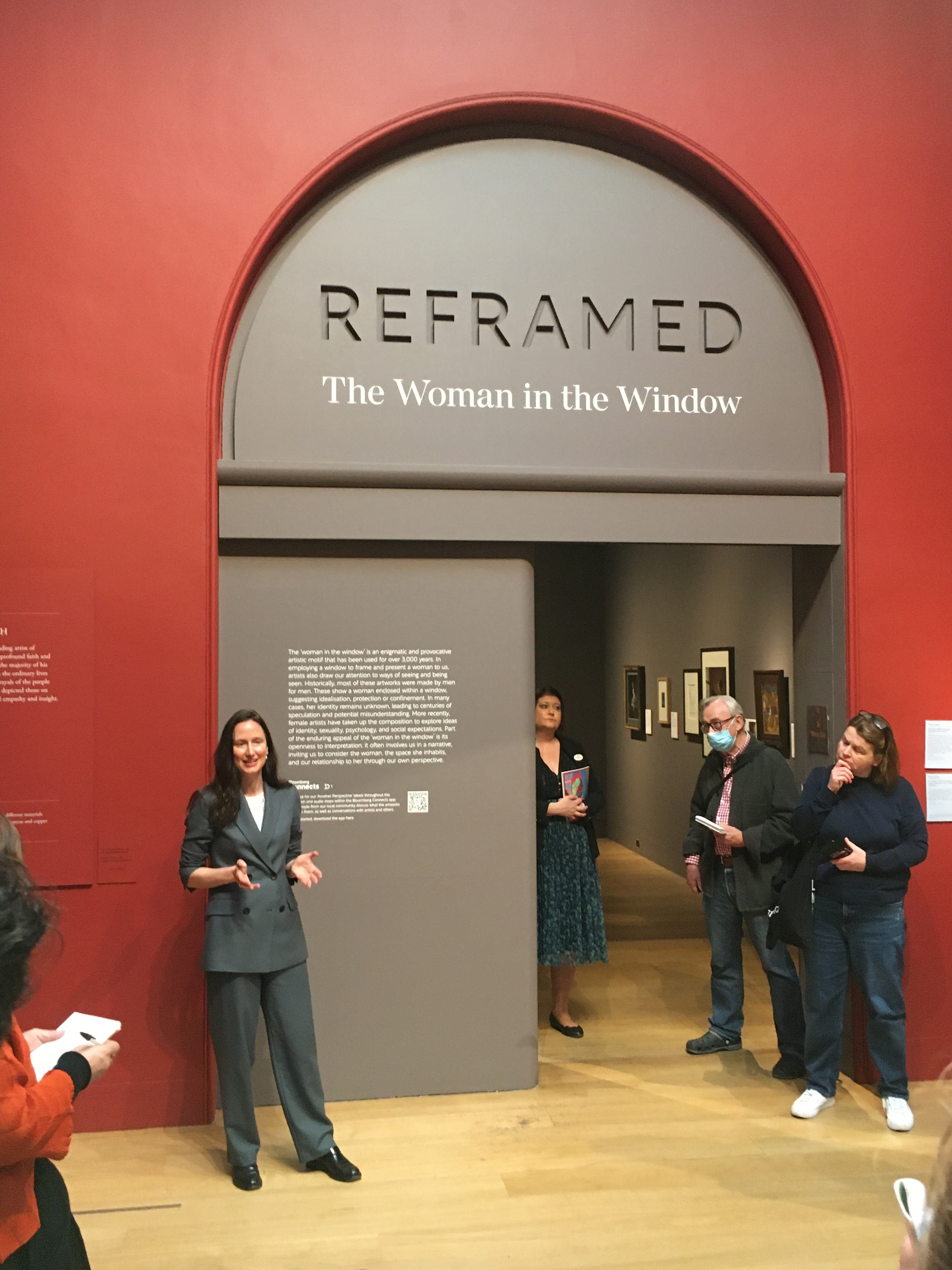
Reframed: The Woman In The Window at Dulwich Picture Gallery

Ooh this is a good idea, and something I hadn’t noticed or thought about until I heard about this show – the repeated motif that can be seen throughout centuries of art of a female framed in a window, whether from the perspective of her looking out, or us looking in.

Last week I joined a preview tour of the show led by its curator, Dr Jennifer Sliwka, looking fab in a grey two-piece double-breasted suit, btw. She first showed us the inspiration for the show, Dulwich Picture Gallery’s Girl at a Window’ by Rembrandt, and then picked out and explained some thought-provoking works, from ancient carved pieces, through Hockney, Bell, Rossetti and Blake, to end with Sherman and Abramovitch, two female artists whose photographic self-portraits literally puts themself in the frame. 

I suppose the question(s) being asked here is, are we and the artists voyeurs, or are we being provoked/invited to look at these women? 

There’s a very clever multi-purpose piece in the mausoleum by Isa Genken, shown bottom left in my montage, that allows you to put yourself in the picture. Inspired by this, I put myself in the picture and took a 'selfie' reflected onto the Howard Hodgkin exhibut (bottom right) which also shows elements of the large photgraphic artwork on the wall opposite.

It's a really interesting and diverse collection. On until 4th September. Find out more here

Reminder to self: finish research for my walk/talk “Female Forms: sculptors and sculptures" 

26 April 2022

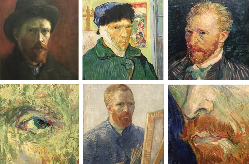
The Good, The Bad and The Unfriendly – Van Gogh Portraits at The Courtauld Gallery

The Courthauld Gallery closed its doors in Autumn 2018 for a refit and rehang that took three years , reopening in November 202. As one of my favourite London galleries I was keen to return as it's an absolute delight, both for its interiors and the marvellous pieces that hang on its walls. Thereare so many very important works of art at the Courtauld. I used to love the quirky hanging, the feel that these rooms were old and special, the mix of different centuries in each room which contrasted the ever-changing styles throughout time. I later read that this was because the artworks had barely been moved since the gallery opened in the 1930s. How cool, I liked that.
Last week I went with my friend to see the collection of Van Gogh portraits – excellent – do go and see them as this now only has a fortnight left to run, ending 8th May. But note that this exhibition is on the top/3rd floor, accessed through the upper gallery of Impressionists art. On the day we visited we had to climb lot of stairs because the lift wasn't working. I was fine, but my friend was in the wars having recently twisted his back. When we finally reached the upper galleries and entered the Van Gogh rooms we saw an exhausted elderly tall man looking around for somewhere to sit and then asking a member of staff for a stool or something. She came back with one of those lightweight fold-up chairs on which he sat looking like a very uncomfortable fisherman, his knees almost reaching up to his ears. 

After enjoying Vincent's exuberant works, and spending quite a while debating whether he was left or right handed* we went for a wander around the adjacent main gallery rooms and immediately we both bemoaned the colour of the walls, especially in these rooms containing the Impressionsts' paintings, which are painted an insipid, almost nicotine-tinged, pale grey that does little to enhance the  paintings which were achieved in the glorious sunshine of the South of France, Paris and Tahiti. Surely here a deep dark blue 'feature wall' could have been implemented to lift and contrast the works within the space? Had it not been for the for the vaulted ceilings and glass above us, we would have assumed we were in any modern gallery anywhere in the world. There was no sense of personality, history or place.  Oh, and the flooring, replaced years ago with light colour solid wood, at first glance resembles cheap clip-together laminate flooring. Surely the enormous budget spent on this renovation could have stretched to a few tins of wood stain in a warmer teak/oak colour...? It just looks unfinished, complete with visible nails. The ramps installed at doorways using the same material seem to be makeshift, but they're not.

And so we made our way down to the ground floor, peeking in at each floor. The pale bland walls persist on all levels. I really did prefer the warmer earthy tones of the gallery pre-2018. Today, the much older works and religious pieces are crying out for at least a stone or terracotta ground to better enhance them. There is only one room that gives a sense of time and place and it's devoted to Vanessa Bell and her tiresome Bloomsbury cronies. 

Back in the foyer, we looked for the gift shop. But where was it? You will recall that the gift shop used to be immediately to the left as you entered the Somerset House complex off The Strand – this space is now a café. We asked the young female greeter with a touch screen where the shop was. She pointed to a long thin sign on the wall that tells us what's on each level and right at the bottom it says 'shop' with an arrow pointing down to the left/right. Er, yes, "but where?" we asked. Without an attempt at a smile she gesticulated us to the Information/Tickets vestibule (which has a big sign above it!) and from there we descended another flight of stairs which took us into a thin underground corridor. I almost walked past the door to the shop which is in a recess on the left. Turns out the shop is vast, much bigger than before and bpacked full of lovely things. Yet we were only two of five people in there, one of whom was a member of staff. We walked all the way to the other end of the shop only to find that there was no other way out and we had to go all the way back again to that narrow door. 

Back in the foyer the joyless female took it very personally when I quereied the location the hidden shop and how they thought they were going to sell anything from that space when it couldn't be seen/found. She evidently took it personally and suggested we could buy online! Eh?! Amused by this response, and also confused how a person who is acting as a customer-facing infomation point couldn't mamanage to communicate in a civil manner, I decided to put my overly jolly hat on and also tell her how disappointed I was, as a visitor for decades, that walls of the galleries had been painted such bland colours. She as good as shrugged. I doubt my feedback wehent any further.

Later, I googled reviews of the gallery's renovation and reconfiguration and found that nearly all the critics seem to have rewritten almost the same thing– how it's now chronological as you go make your way up the building, is a marvellous improvement, that the new cloor and use of light illumates the classical architecture, that the paintings 'sing' against the bright walls. Eh? Really? To my mind, slapping the same colour all over everything enhances nothing in particular.

It's clear to me, having received pre-press packs by galleries prior to preview days myself, that most of these critics had simply just re-hashed the promo information sent to them in much the same way as we were encourged to do in English classes back when I was 12 years old. you know, re-write this in your ownn words, etc. I noticed that only a couple of those reviews made any specific references that lead me to believe that they had indeed been to the gallery themselves and scrutinised it in any way personally. 

No pics – go and check it out yourself, but note that it used to look like this.

Further feedback... 

The café restaurant to the left as you enter the couryard serves bland overpriced food on unstable tables and has a stupid ordering and payment process. I had a sort of warm chicken, bacon and salad sandwich. It was toasted only on one side, barely any chicken, soggy bacon (eurgh), half a small lettuse leafand perhaps two slices of tomato. My friends halloumi and avocado wrap was as bland as the gallery wlls. Luckily, there is a Gregg's a few doors along(!) plus the usual big names and a couple of curry houses. Actually, I'd recommend the LSE canteen on the other side of Alwych, which is excellent value.


There are three large sculptures at the rear of the courtyard that look a bit War Of the Worlds. I could see that they were something to do with the recycled plastics, akin to monsters of the future. I went to find out more about them but couldn't find any info panels so I went inside the northern reception space and asked the chattering ladies at the desk. "Hello!' I said, all jolly, "I wonder if you could tell me about those large sculptures outside, only I can't find anything out there". The silver-haired woman with an accent from across the pond looked at me blankly as if I was speaking another language and informed me in a matter-of-fact manner that there were people out there with clipboards who could explain. As per the young girl in the foyer, she also didn't crack a smile, and I wondered if this was part of the training. Or, perhaps they are automotons. I said it was strange that I hadn't seen anybody out there especially as I had been wandering about for about 5mins quite plainly on the hunt for something. This provoked no response – even those self-service tills at Tescos issue pleasantries!  I moved to the sofas to readjust my clothing and a man who was passing through and had heard the exchange told me there was indeed an info panel out there on the eastern side. So I returns to the silver-haired desk robot and endeavoured to pass this news back her/it should the info be of use going forward. Again the blank stare, as if I was the mad one. Oh well. 

And so I went outside and read the A-board. I finally noticed a young woman with a clip board hovering around at the north side. I stood and waited, thinking she would wander over. Nope. So I stood or paced in an inquistive manner, adopting a series of poses that screamed 'confused' involving scratching my head or chin whilst furrowing my brow and looking from the boar to the sculptures a lot. But, although I was the only person looking at these things, she didn't see me for a full 7 minutes. Yes, I timed it. She then wandered round to the west side, seemed to stare at the paving a lot, and then disppeared into a doorway on that side. 

Basically, it's easier to find the info on their website. And perhaps the woman at the desk can't use the internet. Also, I don't think the plastic elements used in those sculptures are recycled... they all look freshly-manufactured to me.

*some of his paintings are most surely mirror images but others contradict that. I deduce that he was right-handed.

14 November 2021

Summer Show 2021 and Late Constable at the Royal Academy

I've seen a lot of art these past few weeks. And it's all good.

Last week I went to the Royal Academy Summer Show which this year is not restricted to a few weeks in the summer . It's a riot of colour and sort of reflects all the street art and road crossings that are brightening up the City at the moment.* I also like that this year's show has a greater percentage of textured, textural, handmade pieces such as collages and interesting things made out of found, recycled or collected objects. 

So absorbed was I that I only took a few photos and these include, top left, a sculpture by an artist friend, Jaana Fowler. I couldn't take a snap of my mate Johnny Bull's framed print because it was set so high on the wall – hey JB; well done re all those red dots!

And so to the small, but very absorbing, Late Constable exhibition at the RA which I visited on the same day as the Ron Mueck show in nearby Dover Street,

This interested me because I really like John Constable's sketches and preliminary work, more than I do his finished paintings which I often find a bit over-egged, chocolate boxy and twee. This show has some marvellous before and after comparisons (guess which ones I like best!) and lots of his weather studies – rainbows, storms, clouds etc, which reminded me of my A-Level art years when I was trying myself to master a decent cloud-painting technique, with an idea to produce an indulating old-style rollercoster (man made) against a backdrop of cumulonimbus (nature). I never quite got the hang of the clouds and I sort of gave up. Instead I made a simple graduation in the background that I wan't really pleased with. I must have dumped the lot or left it all in the plans chest there because, having just looked through my 6th form sketchbooks and other works I have saved from that era, I can't find any ref of that at all, and I now wish I'd been able to view Constable's efforts when I was a teenager to see how he too struggled to capture the ever-changing Great British sky.

It wasn't just the paintings and sketches that intigued me. We were at first perplexed by the studs and sliders on some of the frame (top right, above), something that we'd never noticed before but surely must be reasonably commonplace. We decided the sliders must be the closing mechanisms and the studs must be little handles to enable the front section, including the glass, to be flipped forward to allow the canvas to be loaded from the front, rather than from the rear which how modern frames are constructed. Please correct me if you know better.

There's plenty of time to see both exhibitions – The Summer Show runs until 2nd January 2022 and  Late Constable until 13th February – both ticketed. However, there are galleries and exhibitions at the RA that are free and well worth a visit. I'd particularly recommend the Collections Gallery on the first floor at the rear (easier via the Burlington Gdns entrance) where there are some marvellous artworks. Also, in the low level linking corridor adjacent to the toilets and lovely cafe, there are some absoultely stunning pieces of sculpture. Find out what's on at the RA here.

*Tbh, I'm not eally keen on those colourful crossings – the ones outside the RA along Piccadilly are looking really mucky these days. There's a good reason roads are a grey colour!

11 November 2021

Ron Mueck at the Thaddaeus Ropac Gallery – Wow in all respects

I had no idea about this superb gallery until I walked inside the door of this unassuming, yet beautifully renovated, Georgian house in Dover Street earlier this week. My friend and I had gone there to see the impressively realistic sculptures created by Ron Mueck and neither of us were ready for the place to be, what has been quoted as, possibly the loveliest gallery in London. 

As we entered Thaddaeus Ropac's gallery we were immediately impressed by the gorgeous wide hallway that leads through to a large room at rear of the building where three of Mr Mueck's pieces are displayed, a room I assume was once used for soirees, dancing or entertainment. Above the receptionist's desk in the hallway there is a gorgeous lightwell in the ceiling that offers tempting views of the floors above and I imagined young ladies looking down dressed in ballgowns, giggling as their party guests arrived.

Ron Mueck's pieces arranged over the ground and first floor, accessed by a superb marble staircase. His works are always oversized or undersized, never lifesize, and I find them absolutely fascinating, which is odd because I am not a fan of photo-realistic paintings. Perhaps it's the scale thing. This exhibition is a selection of 25 years' work and I distinctly recall my sense of awe the first time I saw Dead Dad at the Sensation exhibition and his overly-large Crouching Boy within the Body Zone at the Millennium Dome, in 2000. 

Another bonus – a room immediately to the left of the front door contains a small Marcel Duchamp exhibition – oh what a provocative naughty boundary-pushing man he was!

Everything about this gallery is worth going to see. Oh, and it's free. What's not to like?!