Search This Site

27 June 2022

The Old Operating Theatre – a delight

Last month, after years of walking past The Old Operating Theatre and thinking, 'I must go in there some day soon' I walked past and thought to myself, 'I must go in there some day soon' and then I stopped, turned round and said, 'no, go in there NOW!' 

And I am so glad I did. Finally. They suggest it's a 45-minute experience but I was in there well over twice that. There's lots to see and find out up there including some quite scary surgical implements intermingled with beautiful books and other acoutrements of the trade. 

The volunteers who assists there are full of fabulous facts and info – I really enjoyed the interaction with them which was probably why I was there so long. On the day I visited I was one of only four people up there and I sat in the theatre for ages simply contempleting the room and imagining the noise and mess of the past. The whole space, including the wooden room that houses the museum, complete with it's creaky floor and cabinets full of curiosties, is a delight will definitely return, either alone again or with any friend who also has never set foot inside as I am sure that they too will love it.

The museum is just a stone's throw from Borough Market, London Bridge, Guy's Hospital, and that tall spiky thing. Getting up to and inside is via this door at the foot of the church bell tower and then a climb up a one-way narrow spiral staircase, so be aware that this is not a wheelchair-friendly museum. Find out more here.

This has got me thinking about all the other places that I walk past and think 'I must go in there some day soon' which includes Dr Johnson's House. Really. Hard to believe, I know. I did try once but it was closing in ten minutes.  

22 June 2022

A marvellous manicule in NW5

The Way To Church Lands

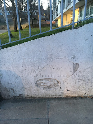
Walking along Gordon House Road a few months ago I spotted a directional panel at low level here just to the right of the protuding block. I took a couple of crude snaps:

This manicule (pointing hand) is probably the most elaborate device of this kind I have ever seen in London. It is not simply painted onto the slab but instead has been carved in low relief complete with chubby fingers and a lacy cuff hinting at wealth and prosperity. This ties in nicely with the kind of well-to-do traders and businessmen who would have moved their families to this area in the eighteenth century – a perfect location adjacent to the open spaces and clean air of Hampstead Heath with direct access into the City via St Pancras and the New Road (Euston, Pentonville and City Rds today). For an idea of this, you need only look the impressive houses along Grove Terrace, set back from Highgate Road. 

Other words are carved into the panel at either side of the ellipse – there is a large cap N on the left and what might be '15 Feet' on the left. There may well be more at the bottom under that veil of render. 

I think the sign points to the beginning of a footpath but I cannot find evidence of that and neither can I work out which church this might refer to. It's also extremely doubtful that the sign is in exactly the same position as when it was first sited because the panel is embedded in a wall that was constructed in 1965 as part of the Haddo House development.

I will update this when I find out more info


20 June 2022

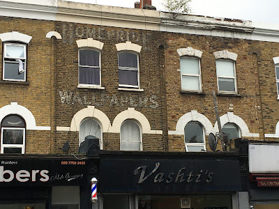
Homepride Wallpapers ghostsign, Walworth Road, SE17

Every time I pass this Homepride Wallpapers ghostsign at 214 Walworth Road it brings a smile to my face because it takes me back in time to the 1970s when many lads wore shirts featuring a repeated pattern of little bowler-hatted Homepride Flour men. I had hoped to be able to link to a pic of a vintage shirt here but I can find nothing available, so if you've still got one of these gems, it's now clearly a collectors' piece. I did find this TV ad though – graded grains make finer flour!

To me, this painted sign conjures up mental images of walls covered in the same Homepride flour men. But where in your home would you paste it? In the kitchen, I suppose, near the larder, and surely only on one feature wall. Sounds like a ridiculous idea, but back in the day, young men who probably couldn't boil eggs, wore those shirts!

Ah, but this ghostsign pre-dates the flour. This is 'homepride' as in a pride in one's home. In the 1930s the shop at No.214 was home to Globe Art, wall paper manufacturers and the 1939 directory shows that the company had quite a few outlets in South London:

I have not as yet ascertained which of these address was the actual manufactory (tho I suspect it was most likely the Tower Bridge address where Haddon Hall now sits) but it is amusing to notice that the phone code for the Walworth Rd location and the Peckham High St shop used to be 'Rodney' as in Del Boy etc – I wonder if John Sullivan knew that when he wrote the sitcom...?

Wall coverings inspired by the Trotters' flat in Only Fools and Horses are suggested here!

18 June 2022

Old shops in St Pauls Road, Highbury and Islington

I am often to be seen walking from Holloway to Canonbury and back, and this means I use the stretch of St Paul's Rd between the two terraces of shops at the western end which still displays some hints of a bygone age or two. The shops on the right hand side adjacent to the Hen and Chickens pub are clearly older and I will return to them another day, but it's north/left side I'm going to talk about here. It starts with a single shop, No.306a, an large add-on to No.306 which is the first of six paired premises. The shops at street level have angled entrances each side of a door that leads to residential accommodation above. The door numbers are beautifully incised into the street-facing fabric of the building in a clear sans serif letterform at each side of the arches with a flower motif above them. 

First, let's look at No.296, today a barber/hairdresser. Above the shop door there two small signs in the glass advertising Ogden's St. Bruno, a tobacco product that is still available today:

In the 1930s this was a tobacconist shop managed by the wonderfully-named Samuel Brilliant. On the subject of names, at No.298 in the 1910s, there was a confectionery shop run by the perfectly-named Miss Eliza Sweetland. I wonder if she was led into this line of work by nominative determinism?!

Two doors along at No.290 is Sawyer & Gray. As far as I can make out this cafĂ© and homewares shop (no wifi or laptops, hurrah!) took its name from a name that was uncovered about ten years ago. Indeed, today's S&G was established in 2012. But the Sawyer and Gray of 1939 was a confectionery shop (Miss Sweetland no longer in evidence). It's really nice to see old signage revitalised like this.  

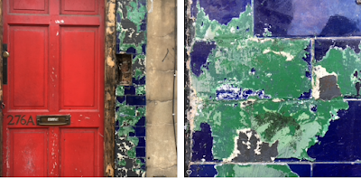
And now to a location past just the bus stop and the cobbled access to the rear. At No.276 today you'll find Firezza Pizzeria. Thick layers of green paint are currently being removed to reveal shiny ultramarine blue tiles. And this suggests it was once a laundry:

A quick look at the old Kelly's directories confirms my hunch. This was indeed a Western's Laundry shop. This blue-tiled exterior being the usual style for Western's and for Sunlight Soap – see more here. Customers' sheets and shirts were collected by vans at the rear via that cobbled side access and then taken to the large facility in Drayton Park which I waffle about on YouTube here(!).  The 1915 directory tells me that this site was previously Isendure Laundry Ltd, an independendent local business that looks to have been subsumed into the Western's umbrella by the 1930s. 

I really hope if they manage to clean off all the green paint and retain the blue tiles, not just for their specific historic value but for logic's sake. I mean, what is the point of painting tiles?! Tiles are washed by rain, or easily wiped. 

Next door to the old laundry, at a site recently vacated by St Paul, there was a dairy/grocery store, no doubt also making good use of that cobbled side access. Throughout bygone centuries, Islington was well-renowned for the quality of its milk – that's a story you've probably heard me tell many times if you've been on my walking tours. 

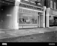
In 1915 the dairy at No.274 was run by a woman called Mrs David Davies. At some time in the 1920s it had become part of United Dairies, a company famous for pioneering pasteurised milk. 

As you can see by my dodgy pics, taken through the window, the shop interior still retains much of its interwar United Dairies tiled walls -clean white wth geometric stripes in two tones of green.  The exterior still retains the panelled sections in the window glass, but the minty-green tiles and air vents at low level have been covered (or replaced?) by wooden panels. This view from 2008 shows those elements still in place when it was a chemist's shop. The archive pic above right shows a UD shop in New Eltham, dated 1933, and this gives us a sense of how this St Paul's Rd store would have originally appeared. How lovely.


17 June 2022

A Co-operative ghostsign in Walthamstow

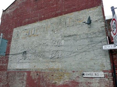
I little while ago, I heard that a Co-operative ghostsign in Walthamstow had been overpainted. I'd assumed it was this one below, on the side of Tommy's Tuck-in Cafe at 422 Forest Road opposite Lloyd Park and the William Morris museum.

But no, passing it on a bus earlier this week, I see it's still there, albeit slighty obscrured by modern signage panels at low level. My pic above, taken on a dull day in October 2008, shows that some of the wording has, over time, been overpainted. A brighter day can be found on retrospective Google streetview here.

The parts that have been covered/saved by a later C20th advertisement appear to read:

SOCIETY Ltd
(...)  Enjoy the Best (....)
Co-operative Trading

Unfortunately I can't get any further with this because I don't have any reference to hand for Walthamstow. At the time this was created, Forest Road would not have been part of Greater London, so do let me know if you can shed more light on this one because the lack of local listings and directories is hindering my sleuthing abilities.

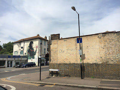
Note the name of the street, Jewel Road – I love that the roads either side of it are Pearl Road and Ruby Road. I have no idea why this should be. Again, any further info welcome.

Oh, sorry, I almost forgot – the 'lost' Co-operative sign mentioned in my opening sentence was at another site further east, visible from St James Street station, here and there are lots of ghostsigns in that area of Walthamstow, almost on every corner.

Both of these Co-op shops would have been rather small compared to the Co-op's marvellous building on Hoe Street which features some fab examples of the society's often-used beehive motif, a symbol of working together. This big store also sports some commemorative panels that show that it was constructed as the Stratford Co-operative Society. Notice also that there is still a Co-op funeral services shop trading from there.

At the Hoe Street end of Ruby Road there is a recently uncovered ghostsign for Warner's the super grocers', an independent local trader who can't have been pleased about the co-op's domination in the area. And another Walthamstow ghostsign that intrigues me can be found just east of Jewel Rd, at the northern end of Wood Street, on the corner of Woodlands Rd – there's a long wall where one of the signs had been covered and protected. It was revealed c2016. I went to check on it a few days ago:

This one is proving hard to decipher. There are tantalising hints of red and black script under that cream paint but thus far I can only name out the word 'The' which is isn't getting me very far. Who knows, perhaps it's another Co-op sign?

Let's keep an eye on these walls because our modern water-based polymer paints will not stand the test of time – the layers of weathershield will gradually peel away to reval the ghosts of the past... ooh, the suspense!

10 June 2022

The [marvellous] World of Stonehenge at The British Museum– until 17th July 2022 (and a tirade about the V&A's awful FabergĂ© show)

I am a bit late behind here – I went to see this marvellous British Museum exhibition back in March and I really thought I'd posted about it, especially as I enjoyed it so much, in many different ways.

First of all, this is not an exhibition about Stonehenge itself, nor is it aboout the other Europens sites mentioned in the blurbs. It's actually about the many beautiful items that were being created at the same time the stones were erected. I must admit that I had glossed over that myself when I bought the tickets (I don't like to be laden with preconceptions) and I am so glad I did that, because the surprise at seeing so any intricately-created pieces really did impress me. I had lots of conversations with other attendees there and we were all in a sense of awe. The gold pieces, in particular, were a revelation to me.

Despite being aware that other ancient civilzations, such as in Egypt, were capable of such fine work, I had never before really considered that the same was happening here. This meant that after seeing the show I went to look at other relevant exhibits in the main museum, specificlly intrigued by the gold torques (collared necklaces).

One display at this the show is a collection of carved spheres, each the size of a cricket ball and all different. An accompanying info panel tells us that it has not been ascertained as to what these were created for, or why. They all have intertwined geometric patterns, circular motifs or textured grids on them.


A man at my side was also intrigued by these orbs and we tried to come up with some ideas of our own. I queried why there needed to have a purpose at all and perhaps they were merely decorative. Consider in the future, what will people think of the pointless items of today such as figurines, ornaments, snow domes, nodding dogs, even Rubik cubes and acrylic fingernails? Perhaps these stone balls were simply something to make whilst chatting with the family after dinner or around the fire in the evening, or the crafters were simply honing their skills or testing out new designs and patterns for use on other larger projects. Could they even be the equivalent of a sample set, like a 3D swatch book? Or were they apprentice pieces like those made more recently in the cabinet making and tailoring trades?

We also liked the cases and cabinets that hold the exhibits here – everything is beautifully and clearly displayed within cleverly-constructed thick basic chip board, painted in colours that evoke stone, slate, wood etc, with all the edges rounded and smooth. 

There's lots more to see than gold and balls... do go and check it oout... five weeks left. Tickets here

From the sublimely simple and effective to the ill-achived mess that was the FabergĂ© exhibition at the V&A – dreadful and disappointing, on so many levels. 

This exhibition ended in May. First of all, you couldn't take photos. Well, that's OK but how can you see the teensy weensy workmanship? I often take a snap of small things at museums simply to be able to zoom in for a better view. And, surely, it's the detail in FabergĂ© pieces that's the most impressive thing?  This might have been assuaged had the pieces not been within cases that only alowed one or two people to view at a time (and here we are in a world of socal distancing!) and only one view possible, from the front. A few carefully positioned mirrors within those cabinets would have been helpful, to say the least. And they could have pasted large format macro shots of the jewelley on the walls or around the cabinets. Or at least supplied magnifying glasses as I have seen available at other museums and galleries. 

The design of the show looked cheap, as if each room had been given to a different first year interior design student as a project. On entering the show there were three big free-standing alcoves, the outer two with nothing in them at all, looking as if they were there for selfie opportinities. Oh, but, no; there was no photography allowed. The first exhibit next to the alcoves was an intricate FabergĂ© piece but with scant explanation and this threw up lots of questions but we couldn't find the answers, even when we realised that the introduction about the man himself was on a wall behind us, such that it is not visible as you enter. Then a queue to view tiny things in those aformentioned cabinets along a wall. This took ages and I gave up half way hoping that things would improve. Nope. 

Other rooms referred to places and people we had not been introduced to before and I kept going back to previous rooms to find info I might have missed only to return empty. We kept asking 'who?' 'what?' or 'where?' such as a big pic of a shop in part of a short movie that we later sussed by accident was Bond Street. To watch this movie involved standing where people were constantly walking past hindering the view, yet there were clear empty spaces in that room that could have been better adapted.

Only one room had an attempt at graphics on the walls, in the form of white lines on a green backround evoking diamonds, yet this was only in the corner of that room. And with no apparent specific relevanceto the pieces within those cabinets. Another room was shoddily 'decorated' with what looked like recycled props from a wedding or corporate event in the form of fake plants and trellis work. We could not understand twhat a garden had to do with it at all. Oh, and half way through the exhib, two parts of the building are linked by a utilitarian connecting tunnel/room that was painted black. Black like a cave. Talk about ugly. Surely something could have been done with this to make it feel part of the show?

The occasional info panels (A3 sheets pasted on the walls) also look to also have been designed by a novice. I have never seen such ugly misplaced typefaces. I managed to take a couple of cheeky photos even tho on the third attempt I was sternly told 'no photos' even tho I expained that I was snapping the info panels for typo reference, not the jewellery. What a jobsworth! As you can see here, one headline typeface is used here and there but not consistently (other signage had random horizontal rules above or below). Some wacky designer has created a font wherby all elements are the opposite of how they are in cuts of say Times Roman etc. Thicks replace thins and it makes for something that's really hard to read. Oh how radical. But why use it here? Also, a similar serif font is used for headings elsewhere, sometimes all caps, sometime U/lc, as per on the Acknowledgements boards near the exit. These two headline fonts are married with a horribly clunky sans serif for the body text that has clearly been designed for screen use. Bleargh! None of the typefaces used bear any relevance to, or enhance or complement the elegance of the high-end FabergĂ© brand. 

And then to the last room where FabergĂ© eggs were displayed in free-standing tall cabinets. Hurrah it was possiblt to walk around all four sides but still not possible to see anything up close and, as with the earlier rooms there was lots of whate space above and below ther glass where large format close-up images could have been installed. Little info panels told us about things inside the eggs that were not visible being as the item was closed. Aaargh. A simple bit of photographic reference would have helped.  The room was horrible, very high, and a strange makeshift-looking dropped ceiling had been installed making it feel like we were in someone's bad barn conversion. And finally, we were amazed to discover there was no shopping experience on exit. We had hoped to flick through some books, admire some FabergĂ©-inspired jewellery and perhaps buy something relevant like an egg-shaped fridge magnet (that's something I have invented right now). But no... into another dark corridor and out into the museum proper.  

If you missed the show, you didn't miss much at all. The pics and info on the V&A website here are much more informative

There's probably mistakes in this Fabergé rant. I wrote it as a stream of consciousness and I am not going back to edit/check it... If the V&A and Fabergé don't care about the details, then why should I?!!

9 June 2022

Cornelia Parker at Tate Britain, 2022

Yesterday I went to my favourite London art gallery, Tate Britain, to see the marvellous works by the wonderfully talented Cornelia Parker. This inspirational woman not only shares my surname but also seems to have similar internal questioning dialogue about the things around us and the patterns she sees on the streets around us. 

A few friends had been to the show already and I did my best to avoid their many photos on social media as I always prefer to see an exhibition/film/performance 'cold' with no preconceptions and that way I get a true reaction on seeing something for the first time, having not been discoloured or enticed by often misleading enthusiasm or criticism.

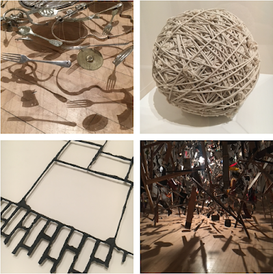
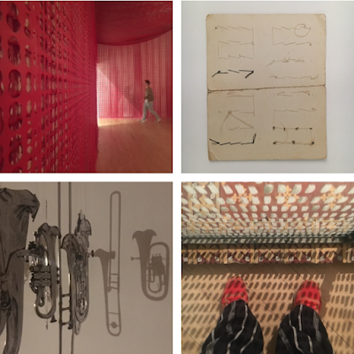
I said I wouldn't take photos myself, but I just couldn't help myself when I was there. These little 'Parker does Parker' shots are shown as snapped in square format and you might have already seen some of them on my janeslondon Instagram feed. I hope they intrigue and entice you. 

 Every room was full of clever ideas. And there were many other things I admired there, and the thoughts and ideas behind them too, each explained in print beside the work written by Cornelia herself, which is really refreshing as we usually have to read generalisms and suppostions composed by gallery curators using marketing-speak. I particularly liked reading how she had spoken to and gained access to various institutions or tradesmen in order to obtain quite unusual products with which to make her artworks. The works about what's not there, remains and negative spaces are particularly clever, I think.

I spent quite a while looking at her set of photos of the wall in Caledonian Rd that is the boundary to Pentonville prison. I have taken many similar photos myeself and call them 'accidental abstracts' created where walls have been patched and partly repainted. Here we see Cornelia doing the same. It's amazing I haven't bumped into her in that area of North London over the years. The render has been recently chipped off the wall, and looks to be in a state of flux. See here. It had previously reminded me of, and gave me a taste for, a pint of Gunnness, where the white met the black in a fuzzy line as here.

Oh and there's embroidery, wirework, movies, installations, and so much more. A marvellous body of work. I will probably go back for a second visit as it is on until 16th October. More info here.  


1 June 2022

A day trip to Leigh-On-Sea

Thanks to my guided tours and online talks these past few years, I have met some lovely people who have become friends. Last month, after leading my 'Arcades and Alleyways' tour in the Piccadilly and St James's area, I was enjoying a few after-walk beers with some women who had attended the tour and, as we discussed the Southend area, an idea was hatched to meet up for a friendly, non-planned, day out in the Southend area, and this came to fruition yesterday.

We arranged to meet at Leigh-on-Sea station at 11am. My train journey to there is lovely. I caught the Overground from Upper Holloway to Barking, a delightfully varied route with contrasting views of leafy cuttings, the River Lea wetlands, shopping streets and industrial zones. Yet I noticed that most other travellers had their faces embedded in their phones therefore missing all the ever-changing delights outside. At Barking I caught the Southend via Grays* (southern route) which offers marvellous views of the Tilbury area, the Rainham marshes, the Dartford Crossing bridge, old churches, cows and horses in fields, and boats and various forms of industry along this part the Thames estuary. Lovely. 

Exiting Leigh-On-Sea station there is an information board which includes the delightful map, above. We made our way down the steps to the access road that runs along the coast, taking in the peaceful views across the mud flats and the beautiful plants and flowers at the path's edge. We were tempted by the seafood in the shacks there but we abstained.


The road morphs into the High Street, still marked with Victorian vitreous enamel signs, and there lots of pubs to choose from. Lots of pubs – a condensation of inns and taverns that in bygone times would have been packed full of fishermen swigging pints of ale and smoking clay pipes after hard days, perhaps weeks, out at sea. We had a beer in The Crooked Billet, then wandered about taking in the architectural details and hints of history. We peeked in at the museum but decided as we were hungry to go back later (oops, we forgot... next time!). Then a lovely fish and chips lunch at The Mayflower.

The tide came in. Chris and Susie jumped ship at this point but Juliet and I continued eastward along the footpath and went up over the bridge to Leigh-on-Sea's residential and shopping streets where were looked at unusual headstones in the churchyard and admired the lovely seaview houses with their metal verandah additions. There are some really good independent shops in Leigh-on-Sea, many of which retain their original Victorian or early C20th fittings in the form of spindle-framed street-level windows and jazz Age era sunray glass, respectively. The rain that had been forecast for the day never really came to much and we managed to dodge the only downpour with a well-timed tea stop. Then we ambled back down to the waterside and got to the station at about 6pm noticing that the tide had gone out again and it all looked just as it had done when we arrived at 11am.

A delightful day out. We two had the whole train carriage to ourselves on the way back, enjoying those marvellous views on either side in a different, late-afternoon, light. We passed the ruins of Hadleigh castle and I thought, 'that's due another visit' and as we went past a sign to Tibury Fort I was reminded that I still haven't been there. How has that not happened?... Must go back again to this part of Essex soon. It's too nice, and too easy not to do so more often. 

*spotted from the train – an old Art Deco era cinema with STATE around the top – it is hard to see from the pedestrianised High Street today but you can see it from the car park here. I have just doscovered that this is a Grade II* listed building. Wow! More info here. Considering I used to drive back and forth twixt Romford and Grays when I was in my late teens and early twenties to meet friends, to go to pubs and clubs in the vicinity, I do not recall ever seeing shopping streets there, let alone a 1930's picture house. My online wander via Google also shows that there's a fab example of an old Burton's shop there too. So let's add Grays to the list of places to visit on my next South Essex venture.