Showing posts with label signage. Show all posts

21 April 2026

Sad to see The Saloon sign in Kings Cross Road has been covered up.

I recently spotted that the old carved and gilded barbershop/hairdresser sign at 205 Kings Cross Road has been replaced with a modern plastic sign. I am disappointed to say the least.

Here are two images showing how it used to look. First my photos from 2008 when the sign was surrounded in bright blue paint (apologies for the low-res image – I can’t access my originals right now) followed by a Google streetview screengrab showing it in 2022:

But this is how it looks now, blending into its surroundings and looking like an extension to the shop next door:

Pics: Jane Parker, 20 April 2026

This old carved and gilded sign was a stop on my Kings Cross Ghostsigns guided tour. Whilst leading that tour in April 2024, two of the barbers came out to listen as I talked to my group about the sign-making process and who made this, as indicated by the name at the bottom right hand corner.


A conversation ensued. The barbers told us that they were planning to change the sign because they felt it didn't advertise their company, that 'The Saloon' made no sense, that potential customers didn't understand what was being offered. I/we responded that everyone in the area knew the sign as a local historic landmark and with the barber's pole and their own bright red A-frame signage outside they surely didn't need to change anything. We begged them not to change it. 

They pondered and then asked me if I knew a company that could repair the sign because the gilding within some of the letters has slipped. This is visible in the pic above. For me, the slippage is a bonus as it shows the handmade construction process. I gave them a few company names (which they didn't write down) as well as my business card, and told them to contact me for more info. I never heard from them. Going forward, every time I passed I rarely spotted any customers in there. 

They clearly blamed the old sign for their lack of business because, at some point in the last few months, they have had a new sign installed: 'King's Cross Stylist Barbers'. I have my fingers, toes and eyes crossed that these two sheets of printed plastic have been placed across the old sign which at least will protect it, for someone else to rediscover in the future. 

But I am at a loss how they think this new signage makes the shop look more attractive. Black black black (or charcoal grey) – it's everywhere these days. Grunt. People seem to think that a scripty font on black is all you need to appear stylish and upmarket. Nope. This example looks like it was designed by someone on an episode of The Apprentice! 

Here, the branding, for want of a better word, is dark and gloomy, looking more like a funeral parlour. They have also replaced the jolly red hanging sign with a similar funereal style. 

But here's intriguing... under the main name there is a secondary line that says, 'London - saloon Est.1989' – Eh? What? How? Who? 

I wonder if this is a typo and they actually mean Est.1889 because, as far as I can make out, there has been a similar business here/next door since at least 1895, when Albert Kretschman, hairdresser (a term that used to be applied to both men and women) had a shop at No.207 until 1915. I'm guessing that Albert moved into No.205 sometime after WW2 and this dates the sign to the early interwar era. Albert is gone by 1939 when the shop is listed as Jacob Lewis, watchmaker. Perhaps Lewis covered the sign with his own thus protecting The Saloon sign until it was revealed I know not when*

The frustrating thing is, the change of signage does not appear to have made a difference to their footfall here. When I popped back yesterday lunchtime to take the pics above the place was empty apart from one fella who was sat on one of the chairs opposite the mirrors and basins, scrolling on his phone. I assumed he was waiting to be attended to, but on reflection, I now think it was one of the barbers. Such a shame on many levels. 

*If you can add to the research or can remember this area of Kings Cross in the 1950s onwards I'd love to find out more. Please leave a comment or send an email: jane@janeslondon.com

If you enjoyed this, you might like to read about the loss of a grocery store in Tufnell Park and a couple of dairy shop fronts near Portobello Road and near Highbury Corner 

29 June 2024

London street signs – additions to postal zones

My last post mentioned a patch added to a sign along The Broadway in Woodford. This got me thinking about the many additions and changes to street name signage across London. This became necessary as an area has became so populated that the postal district had to be sub-divided, such as Holloway N, becoming Holloway N7, etc. 

As London expanded, districts needed to be defined to prevent confusion between, for instance, Brewer Street in Soho and a road by the same name in another part of the metropolis, and so simple points of the compass were added. More often than not a complete new batch of signs was created to replace/cover the old ones. But in some places, a little patch or tile was added adjacent to the existing name plate, such as these examples in Soho where a small white tile bearing a red W for West has been added next  to the brown and white 1870's tiles that show the street name:

Soho's single letter square tiles are perhaps copies of the similar, earlier, more elegant ones in the Hampstead area where there are also some later additions:

Single letter tiles can also be found in nearby Loveridge Road NW6. Near there you'll also find some lovely blue and white vitreous enamel signs, such as this one in Oxford Road which, like many others in that vicinity, has a little metal plate to the side: 

But surely a more effective and visually pleasing amendment would have been to make small blue enamel [N.W.6.] signs in a condensed typeface to competed cover the N.W. within the sign itself? These could have then been spot welded to the original sign. Hey, but what do I know?!

This extraneous patch device can also be found in W8, as shown below in Cromwell Grove where the little metal tiles that display the full postcode of that era have been better designed completes with fancy corners and affixed centred under the street sign. But where is West W6?!

In Strode Road NW10, it looks like the local council was on a money and time saving exercise as the basic little hand-painted metal add-ons here look like they were created cheaply and attached in a hurry. Incidentally, the punctuation on these old signs often intrigues me. Full points, and sometimes semi-colons too, randomly applied, like a game of Spot The Difference. For instance what happened to the full point after W on the Cromwell Grove sign? But I digress. 

Finally, staying in NW10, in the well-to-do Chamberlayne Road area there are elegant cast metal N.W. signs that also have little 10s attached to the side or below them, but here we can see that the contractor remembered to use a spirit level:

I do like these little quirky add-ons. When councils created complete new street name plates they were mostly fixed directly over the previous one. There are, however, instances where new signs were placed adjacent to the old ones which can be a bit confusing. I will compile a collection of some of my favourite oddities in a future post. 

22 June 2022

A marvellous manicule in NW5

The Way To Church Lands

Walking along Gordon House Road a few months ago I spotted a directional panel at low level here just to the right of the protuding block. I took a couple of crude snaps:

This manicule (pointing hand) is probably the most elaborate device of this kind I have ever seen in London. It is not simply painted onto the slab but instead has been carved in low relief complete with chubby fingers and a lacy cuff hinting at wealth and prosperity. This ties in nicely with the kind of well-to-do traders and businessmen who would have moved their families to this area in the eighteenth century – a perfect location adjacent to the open spaces and clean air of Hampstead Heath with direct access into the City via St Pancras and the New Road (Euston, Pentonville and City Rds today). For an idea of this, you need only look the impressive houses along Grove Terrace, set back from Highgate Road. 

Other words are carved into the panel at either side of the ellipse – there is a large cap N on the left and what might be '15 Feet' on the left. There may well be more at the bottom under that veil of render. 

I think the sign points to the beginning of a footpath but I cannot find evidence of that and neither can I work out which church this might refer to. It's also extremely doubtful that the sign is in exactly the same position as when it was first sited because the panel is embedded in a wall that was constructed in 1965 as part of the Haddo House development.

I will update this when I find out more info


30 December 2021

Clapton ghostsigns – hints of upwardly-mobile Victorians and a multi-layered engma

I've been wandering the streets a lot these past few weeks. Either just following my nose, investigating places I don't know so well, or planning walking routes for the future.

I was recently near the River Lea in the in Clapton area and thought I'd best go and check on a couple of old bits of signage near the main drag to see if they were still there. And indeed there were/are.

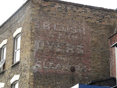
Just east of the roundabout on the north-facing wall of 203 Lower Clapton Road, today a Ladbrokes betting shop, there is this a hand-painted sign for S. B. LUSH & Co. Ltd, dyers & cleaners, rendered in white 3-D effect block letters on a red panel. If we look back to 2008 we can see that it's in reasonable condition because it was, up until then, covered/protected by a boxed sign.

A bit of sleuthing shows that 'Lush & Cook, dyers' were here from at least 1896 until the first few years of the 1900s and by 1901 the name had changed to become 'S. B. Lush & Co' – I wonder what happened to Mr Cook? So far I have not managed to ascertain if Messrs Lush and Cook were here pre-1896 but I have found evidence of S.B Lush & Co at some very well-to-do locations in central and NW London. For instance, in 1891 the man/company was at 6 Wigmore Street, W1, and also at 1 Motcomb Street, W1, 38 Ladbroke Grove and 105 St John's Wood Terrace – so this really gives us a sense of how upwardly moblie this area of Hackney was at the end of the 19th century. The company had gone form here by 1904 when this became the premises of a milliner, followed the following year by a piano maker. For the period 1908-14, it was a confectioners, owned by a Mr. Thomas Taylor. So now I'm asking, what happed to Mr. Lush?

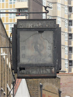
I continued my walk southwards to the corner of Downs Road where I was surprised and rather pleased to see that the filthy broken 'Art Deco' era clock for Strange Chemist is still hanging in there above today's pharmacy which still bears the same name as it did in 1939. They really ought to, at least, give this old timepiece a clean-up. 

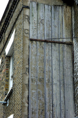
Then round into Downs Road, and immediately left into Clarence Road. On the right hand side, a little way along, on the side of No.163, there is a double-layered sign. I stood looking at it, amazed that it was still intact, albeit faded. It appears that over a century ago, a hand-painted sign on the wall was covered with wooden planks that were used as the basis for a secondary sign. The wood is held in place by an angled arm of metal. It's hard to believe how this structure is still there!


The wooden sign is very bleached and faded today and there is barely any paint left, but my pic here from July 2008 shows how the letters on the boards were almost discernible and would have been even clearer had I vistied it a decade previously. I think I can make out the word 'dealer' two-thirds of the way down here. As for the sign underneath, the tantalising letters peeking out at the left hand side of the boards, give little away but there's a letter R at the top, so my guess is that the sign could be for Miss Ann Reynolds, haberdasher, who was there in 1901, and/or William Richardson, builder who was listed as being next door at No.165 in 1914.  

This is so bizarre enigma, don't you think? Just what was the though process here? Was the second sign menats to be temporary? Because, surely it would have been easier to whitewash the first sign and then over-paint it. Does anyone have any other ideas?

Please do let me know if you have any further info on any of these..

5 November 2019

Tutankhamun exhibition at The Saatchi Gallery – it's good but it's not good

Last week I went to a preview of this exhibition and it's been playing on my mind ever since as to what to write here. I was initially excited to be going to see the exhibition, but for many reasons it's been troubling me. And will continue to do so.
The show is on tour "to celebrate the 100th year anniversary of the discovery of Tutankhamun's tomb". Hmmm... I think "celebrate" is a dodgy word here. "Commemorate" or "mark" might be better. But more of that later.

The 150 Treasures of The Golden Pharaoh are indeed amazing. The attention to detail, the fine handiwork, the quality of the artefacts, is truly outstanding. Most of the pieces on display look like they were made last week; they are so shiny and perfect. I am in awe of the craftsmanship of these ancient people.

I was intrigued as to how the Saatchi Gallery would manage to display everything being as the gallery rooms are not well-linked, as per, say, the Royal Academy where one room leads to the next. Let's just say it's not good. I was there before the exhibition opened to the public and I can't have been the only one complaining about the lack of signage or misleading information.
Here goes...

On entering the show you are treated to a short wide screen film about the location of the Valley of The Kings, what the Egyptians believed about death and gods etc, and an overview of the discovery of this particular tomb. You then enter the first gallery room which is full of gorgeous artefacts. All lovely items, yes, but I must admit that I rather thought the show might be sort of chronological and perhaps make it feel like we were entering the tomb as Howard Carter did to give a sense of discovery. But no – it's boom! bang! here are the shiny gold things!  I found it hard to place what I saw in context with the tomb.
More beautiful artefacts in the next gallery and the next. People faffing with the audio handsets which weren't explained properly – note that you need to enter the number that's on an exhibit and then wait a few seconds for a click and then a few seconds more for a voice. Shame there's no fast forward or rewind. I gave up. Though listening to the talking was preferable to the having to endure the dreadful ambient music. Is it supposed to sound as if it comes from 3000 years ago?!

I was constantly distracted by the display and info panels in the galleries. The walls are all plain grey or have printed panels attached to them. The doors between the galleries have been half-heartedly designed to look like temple doors but they are painted dark grey. Why not sandstone colour? And why aren't the walls of all the galleries designed to look like the inside of the tomb or an Egyptian temple? If IMG, the event organisers, can afford to get panels printed then why not choose or create evocative imagery for them?
Many of the printed info panels were crumpled and creased and poorly stretched onto the frames. Close inspection showed a range of different man-made oil-based fabrics some satin, some textured, some like neoprene, some rigid. But none appear to be very eco-friendly. Here's the Egyptians using wood and stone and natural components yet here in the 21st century are displaying them in a sea of plastic. And and don't get me started about all the exhibition-grade grey carpet also in use here that gets trashed at the end of every event... grr.

From a typography and design perspective, the information on the panels is also a mess. There doesn't seem to be a style guideline. Surely the same typefaces could have been used throughout as the event toured? I must have counted at least six different typefaces and sub-fonts yet none of them looked very Egyptian. Most text is set ranged left, yet smaller info panels are fully justified (a crime unless it's a text book!) with so many ugly hyphenations including proper nouns such as, get this... "Tutankha-/mun's", "Tut-/ankhamun", and "Neth-/erworld". Oh yuck!

I spoke to someone from IMG about the ugly signage and her excuse was that the exhibition had been travelling and they couldn't change it. Er, really? Another excuse for this evident lack of quality control was that the exhibition is now nearing the end of its tour. I assume she meant that it's too late to bother now. I didn't like to point out that I doubted that this wouldn't have been in english language when the exhibition was in Paris, for instance, and it's unlikely that all the exhibition spaces worldwide are the same height and width. The pharaohs would not have put up with this!

The galleries on the ground floor are full of lovely artefacts. It's then up a staircase (or use the lift) to get to the upper the galleries. On finally entering Gallery 4 there is, what I later understood to be one of the most impressive finds, the wishing cup. Yet it's sited in a dull room that looks like just a lobby to a better place. I sat at the bench there to write notes. An audio kicked in but I didn't really pay attention until I realised it was about the discovery of the tomb, so I watched it for a few seconds and then spoke to a steward to tell them that hardly anyone will stop and pay attention after they've seem rooms full of marvellous things. People will just want to move on and find more gold.
Ah, but there isn't any more gold after that, except for a gorgeous necklace/ pectoral chain with an interesting story that I as good as walked past without noticing, only returning when I realised that the room was all about Howard Carter's find and the layout of the tomb etc. Which begs the question, WTF is this doing on the upper floors?! It would have been better placed in the first gallery to tell the story and then have it followed by the wishing cup and all the other artefacts. And the diagram of the tomb would also be better placed down there. Actually, put the diagram in every room with a dot showing where each piece was located when it was found.

Gallery 5 has a big statue in it. I am being flippant here. It's marvellous. Impressive. I moved on to Gallery 6 and found it's not a gallery; it's a gift shop which continues through into the next room. So misleading. And the shop looks like it was thrown together last week. Well, it probably was.
There were a couple of red virtual reality pod things on the top floor – these are immersive experience thingies. I didn't get to try one out. Lots of them should, by now, be arranged in that room resembling the alien nursery in the first Alien movie. I think they should be turquoise blue pods rather than red – perhaps they are left over from an exhib about China?! Also on the top floor you'll find  some interesting work by artists in residence. I like the crochet reference.

Basically, I left the Tut exhibition disappointed and a bit annoyed/frustrated. It's clear to me that the Egyptians' attention to detail has not been followed through in these slap-dash modern surroundings.
If young King Tut is still looking over us (he believed he'd still be alive if we continue to speak his name) then he will be disappointed too. The stipulations in his will asked that his mortal body be buried forever with all that he needed for his next life. Is this really what he would have wanted?
When we ask to be buried in a certain place do we really want to be dug up by tomb-raiders masquerading as historians who are really on a treasure hunt for personal kudos just trying to prove how much cleverer they are than the ancients? These people don't "discover" the tombs, like some kind of fortuitous accident – they hunt for them, they track them down, like completing the hardest puzzle, solving the most complicated riddle.
I wonder... shouldn't all these artefacts be still in the Valley Of The Kings where they were designed to be? Thousands of years of years buried away until some bloke in a pith helmet bursts the bubble.

Walk like an Egyptian – join me on one or both of my guided walks in Central London – see the schedule here.

5 March 2019

Flipped Pedim ghostsign in Upper Holloway

This has intrigued me for years:


In Tollington Way, Upper Holloway, N19, on the corner of Cornwallis Road, there was up until about ten years ago a fish and chip shop and restaurant. The building has subsequently been converted into residential use and all signs of battered cod and sausages have been removed.
However, above one window we can see the reversed print of a company name S. M. PEDIM which, judging by the letterform, looks Edwardian in style.
I would assume a sign with this name on it had been painted onto a piece of wood that was later reused; flipped and attached to a wet wall, therefore transferring the name onto the plasterwork.
I can find no evidence of anyone called Pedim in the reference I have to hand.
Any ideas? 


7 August 2018

Holloway Leather Stores – lovely carved wooden shop sign reveal in N7

Look what I noticed last week (Thursday 2nd August)...
A shop at 229 Holloway Road is at the moment empty and available for rent through local agent Drivers & Norris.
A lovely old carved wooden sign has been revealed. This would have been the backing part to another later of glass that sat against it and made the letters 'ping'.
I particularly like how it's dropped it's H, as in 'olloway!


I have tried to find ref of this company but cannot see it listed in either 1895 or 1915 which are the only directories I have to hand.
If you have any more info do get in touch.

Thanks in advance

Update1: I put this on the Islington Archaeology & History Society Facebook page and one lady responded with this:
Early 60's I used to have my shoes made there, you picked out the leather and style you liked. They had outlined both of your feet on cardboard, which they kept in a filing cabinet. It took 3- 5 days dependinfg how busy they were to make the shoes. They were stilletto's with pointed toes. They also made handbags and you could choose the colour and type of leather plus the style. They were the best shoes I have ever worn. 

Update 2: (Wednesday 8th August) Went past it on the bus this morning and could see that the old sign as been covered with a modern sign that encases it. So it's still there but no longer visible.