Showing posts with label hotels. Show all posts

20 July 2026

Update on the Imperial Hotel renovation at Russell Square

Let's cut the chase*  – oh dear, it's as I feared. Here is an update about the renovation of this marvellous example of 1960's architecture.

It used to look like this, giving luxury airport vibes:

In my previous post I had written that I had been told that the orange letters (Eurostile/Microgramma with gilded outlines and recessed centres) would be reinstated. Er. No. 

A few weeks ago I noticed that much of the scaffolding had been removed. I snapped this image:


Here we can see that he orange letters have been replaced with some boring blocky letters that I'm pretty sure are from a typeface, a font, created for web use. The twelve letters (inc wd #) is now crammed into a panel that before contained just five letters.

It's just THE IMPERIAL now. The word HOTEL has been dropped. Hello cabbie, take me to The Imperial. Perhaps they then get driven to the war museum or the college, ha ha!

A closer look:

Check out the strange choice of letterform here, especially that ugly letter M which is overly wide and has a truncated centre. Unless this M is being used as a feature, some kind of impish design device on logos and branding, I see no reason to choose a 'font' that has such a bizarre quirk which is echoed only once here, at the top of the letter A. To add to this, some of the other letters have very slight angles on the ends of verticals and horizontals, such as the Es which have what I can only describe as italicised ends.  Ditto the very the top of the I (shudder). These quirks further highlight that the letters haven't been installed properly – some of them aren't straight – I mean, how is that possible when there's a simple golden grid to follow?!

I'm disappointed. People are often telling me I moan about things. That's not the case. I'm often merely disillusioned or saddened after hoping for a good outcome, made worse when things could have been better achieved so simply. Also, with my eye for typography and design I can often see that things haven't actually be designed or thought through properly.

Many logos on our high streets today are created as scalable vector files using web-based fonts designed for emails, and on-screen applications. Everything is becoming super-simplified, thus losing an sense of design. Logos or brand names are kept simple so that they can be scaled down small for use on an app icon or a web bar. Back in the day we would design a suite of logos for a client – a small logo for pens and business cards, a mid-sized version for print and press ads, and a larger more detailed one for shops signs, billboards and vehicles. Today, many logos that are simply typed out, often with no regard for letter-spacing. Ah well. This is progress. But I digress.

Here at the The Imperial (hotel) I suggest the letters are based on, probably pulled directly from, a modern scalable font designed for web use because sharp points on A, M, N, V, W, and Z do not scale or render very well on-screen, hence many new fonts designed specifically for computer use have been been pruned. Verdana, created in 1996 and shown below, is fast becoming one of the most ubiquitous typefaces, clearly outstripping Gill Sans, the Sans Serif favourite of the 1930s (British Rail, Penguin Books, BBC, Tommy Hilfger etc). 

ABCDEFGHIJKLMNOPQRSTUVWXYZ 

I'm also not a fan of Verdana's topped and tailed capital 'I' – there is another similar typeface being used a lot lately that also employs this same device – it implements even wider bars making short words like PIN, HIT and BIO and look very strange indeed (ugh!) – if you can identify it, please let me know.

Thanks for getting this far – I had intended this post to be just a quick update with a couple of pictures and captions, but I got a bit carried away!

*Cut to the chase – surely this should be 'cut out the chase'? Do we not get straight to the point after saying this and miss out the journey?

14 November 2025

A Deco-tastic wander around Claridges at Christmas – sensational and slapdash

A couple of weeks ago I attended an Art Deco-themed event at Claridges when the stylish and ever-young Virginia Bates showed us a selection of some of her Jazz Age clothing and accessories. Ooh lovely. I was so taken by the quality of the items and the conversation that I only took these two pics. 


After the event, it would have been remiss not to pop into the lovely ladies' lavs adjacent to the Davies Street entrance. It's gorgeous in there (go google for pics) but this time I noticed some recent bodge jobs that are at odds with the impeccable quality of the original elements. For instance, why oh why have they employed cowboys to fix substandard cheap fittings that can be bought off the racks in any homewares store? 


Two-pronged 'butterfly' hooks of this type can be bought four in a bag for about £2 here in Holloway. Yet Claridges' management has allowed these cheap things to be screwed onto wood panels and mouldings, as well as the insides of the marvellously marqueted doors within the cubicles. Most of the hooks are are not even hung vertically, which I know is hard to ascertain in my wonky pic (how ironic!). Notice also the use of basic cross-head screws where surely some chromed dome-heads with straight grooves would have been better suited. I took a pic of the gorgeously flamboyant door handle to cheer myself up and later noticed that the brass panel beneath it it is also affixed with nasty modern screws. 

Ugh! 'It's all in the details' here takes on a new meaning. Read on, dear reader...

Last year, walking along Brook Street I stopped to take a couple of snaps of the entrance to the ballroom which is only ever open when an event is happening in that space. I particularly love the metal gates in a style I personally refer to as 'Hollywood Deco' and the canopy above with its zig-zags panels and various finishes.


On that late November evening it had occurred to me that seeing as the Christmas decorations were already installed I should go inside and to investigate. Until a couple of years ago hotels wouldn't put up the decs until the first weekend in December. What's gone wrong with the world?!


Heading through the main door into the hotel... 

...then turned left and followed my nose into other areas, finding that most spaces were available to me because there weren't as yet, any events happening.

There are some evocative displays of Art Deco items either side of the corridor that leads towards the entrance to the ballroom. Below left is the view to the ballroom and other salons. The second pic is the view to the Brook Street:

Elegant Jazz Age metalwork and multi-layered mirrors are everywhere.


Two framed artworks by George Sherringham enhance one space. 


These are retrospective illustrations of the Britannia Theatre Hoxton and the Drury Lane Theatre, 1800. I have no idea if these venues have a specific relevance to Claridges in particular. Sherringham was contemporary of D'Oyly Carte and had created many backdrops for his Gilbert & Sullivan productions at The Savoy Theatre as well as a large scale artwork for the ballroom here which I can find no reference of today. 
The ballroom didn't seem that impressive to me. It all looks a bit corporate, sanitised and bland, more like the spaces you see in modern Dubai hotels, all black and white marble with square-cut corners, but with none of the artistry or clever design. 


In most of the pics I have cropped out other hints to the our modern world, such as trailing electrical leads, nasty plastic shelving, things made from that shiny chrome-effect stuff that looks like it was bought from B&Q, and shoddy repairs here and there. It's a shame that it's now only the original mirrors and light fittings that give a hint that these spaces are almost 95 years old.  I'd love to be able to time travel to see what it was actually like here in the thirties. 
I had a good wander about. Hardly saw another human, except for a couple of guests who had taken a wrong turn and wanted to get back to the reception, and the odd member of staff who either ignored me completely or gave me a cheery hello as they whizzed past. 


Before leaving I took a quick selfie in the mirrors and used the felicities (as I like to say) then headed back outside into the chilly streets to investigate more twinkling spaces. 

I'll pop in again soon and add pics of this year's decs. 

27 March 2025

Mr Cranston's Waverley Temperance Hotels – a link between Edinburgh and London

I've just returned from a long weekend in Edinburgh. Lots of walking. Lots to see. And, of course, I took lots of photos. 

As I was walking back towards the Old Town along Spring Gardens last Friday I noticed a ghostsign on the side of a building overlooking the railway line, the largest visible words 'WAVERLEY HOTELS'. 


Although I'd spotted lots of old hand-painted signs across the city I'd decided to restrict myself to just looking at them. But this sign was so huge and inviting – I had to try and get closer!
This end wall sits a little over a metre from the viaduct that carries the tracks and with my back pressed against the railway wall I managed to take a couple of oblique upwards shots but my old phone isn't really the best device for taking pics like this. 
I have today tried find a better quality image, because surely someone must have got there first, but I can't find reference of it anywhere which is probably because trees obliterate the sign for most of the year.
I have therefore done my best to enhance and stretch one of my dodgy pics in order to read the content:


CRANSTON'S
WAVERLEY
Temperance
HOTELS
EDINBURGH
Princes Street
AND
Waterloo Place

GLASGOW
WAVERLEY
182(?) Sauchiehall Street

LONDON
WAVERLEY
37 Kings St, Cheapside

(CRA.... ALL.... NO... S)

(Bottom left)
FOR TEA
DINNER 2/-
ROOM 1/-

(Bottom right)
PRIVATE PARLOURS 3/-
SERVICE 1/-
STOCK ROOMS From 2/-

(and two more lines full length across the bottom edge that I can't decipher)

The London Waverley hotel at the corner of Cheapside is no longer there but it reminded me that I'd found this ad in a 1935 Ward Lock London guidebook for three Temperance hotels near the British Museum, one of which was called The Waverley. You'll can still find it today at 130-134 Southampton Row, near Russell Square, though no longer part of the temperance movement, ditto The Ivanhoe and The Kenilworth which sit opposite each other at the junction of Gt Russell St and Gower Street the former since rebranded The Bloomsbury Street Hotel.

But who was Mr Cranston? Well, it turns out we have another link between Edinburgh and London because Abney Park's website makes good mention of Robert Cranston within this entry for Elizabeth Elliott Scott who worked at one his hotels in Lawrence Lane, Cheapside – it includes a marvellous 151 advertisement for Cranston's hotels 

As for the Waverley Hotel in Edinburgh – on Monday, with time spare before my train back to London, I'd stood opposite the building and wondered whether I should go for a look inside to see if there was anything left of its Victorian interior. Having not started this research until today, I had not at that time made the connection to the Temperance movement and simply thought that t was named after Edinburgh's Waverley railway station. I instead sat on a bench in the sunshine and did a bit of people watching. Having googled the hotel's history, I can now see that I would have been disappointed –the hotel's fancy, albeit grubby, façade belies its interior which has been stripped of all historical decoration, making it almost indiscernible from many other hotels of this ilk.

Robert Cranston is buried in Grange Cemetery, Edinburgh.

Almost forgot – the sign is painted on the side of a Victorian social housing block at 10 Brand Place which retains its access from the street via an open staircase, very similar in design to the developments erected by Sidney Waterlow and his IIDC friends in London.  

12 October 2024

The Piccadilly Hotel (today The Dilly) and Cordings – a glitch in the timeline?

I popped into The Dilly to see if there was anything left of what was, over 100 years ago, often described as one of the most impressive hotels in the world. I was on the hunt for any of its original 1908 construction or the 1920s revamp when it became one of London's best Jazz Age venues. Suffice to say, I couldn't find much from either period, but I did uncover an enigma whereby the dates for certain things simply don't make sense. 

This huge central London hotel fills the space bordered by between Piccadilly, Air Street and Regent Street. Its exterior at the time of writing slathered in scaffolding. However, many information boards attached to that metal protection hint at the building's history and the modern facilities available inside. 

I wandered into the bland foyer which still retains the three lovely ceiling lights. These elegant glass domes seem to me to be at odds with the modern PVC panels and printed info below, advertising the range of facilities available on other floors:

The room at the far left of the reception area retains some history – it is today Madhu's of Mayfair, offering Indian cuisine, set within the ornately sumptuous surroundings that was originally The Grill Room: 


Note the image bottom right above which is from one of the panels on the exterior of the building. The second photo within that shows a second room with lovely ceiling lights, which I also did not see on this occasion. I'll need to go back again. 
Returning to the reception area, there's an unmanned temporary counter advertising 'Downstairs at the Dilly'. I'd also noticed a sign on the exterior depicting an 'exclusive' dance studio, by which I am assuming that it's only residents or members who can use this facility.  

Convinced that either one of these spaces would have been the hall used for parties in the 1920s when the Bright Young Things dressed up in tailed suits and beaded dresses and danced the Charleston into the early hours, I headed down the stairs to investigate further but I ended up in a small basement lobby leading to a gym. Hmm. I'll have to check out some floor plans and go back for another try. I'm now recalling that there's an elaborately columned swimming pool down there somewhere too. 

Scuppered, I then headed to the upper floors via the lovely staircase which, I assume, dates from 1908 when the hotel first opened. Marble, metal and wood in elegant harmony, albeit badly married with some nasty modern carpet. 


On one of the landings there is an old London map etched into metal and lit so strongly that it's hard to see in person, let along photograph it. I've done my best here in an effort to show how bizarre it is that the designers of today's hotel have installed a map that shows this area before the hotel existed yet there is no annotation or explanation on or near it to explain to the uninitiated what they are looking at!

It's actually a very fascinating map and one I am not sure I have seen before. Note Regent Circus for Piccadilly Circus, dating it to the 1820s.  

I took a snap of the layout of one of the floor plans and continued up the stairs to The Terrace, passing through an area festooned with horrid fake plastic flowers* and a screen advertising the facilities available at the hotel. This includes a bizarre image of a 'bride and groom' entering the ground floor lobby. This repeats along the exterior of the building and I have often shown this image to friends to point at the strange camel toe effect at the front of her dress at thigh level – ugh!  Has the marketing department at The Dilly not heard of photo editing software?! And whilst I'm in picky mode – that TV screen isn't level. 

But the terrace area itself is actually a lovely space with, considering its locality, reasonably priced fare (ooh, careful Jane!). It sits behind the columns that run along along the main facade. Back in the 'Art Deco' era this terrace included an outdoor circular bathing pool, approx 4metres diameter, just like like one of the large collapsible ones you can buy today. I know this because I have photo somewhere of some young women in bathing suits here – when I locate that image it I will add it to this post.

And so to the enigma. It's about the timeline of this building which, doesn't seem to make sense.

Richard Norman Shaw's elegant Palladian/Baroque designs for this hotel are said to have started in 1905/6 with the 300-bedroom building opening in 1908 offering a wide range of additional facilities that included the aforementioned Grill Room, three basement floors for hospitality and entertainment, and four Masonic lodges(!). An illustration of the building is included within the info panels on the outside of The Dilly and within the in-house promotion. 


It comes from an advertisement in the New York Herald dated 1911, three years after the hotel had opened. 
But here's the enigma – look closely at that illustration and note that it is a drawing, not a photograph, and the hotel is depicted as covering the whole block including the corner space, complete with a flag on it. and Air Street is shown to be as big and fancy as the Piccadilly side, which is not actually possible because the hotel never covered this corner section at all. 
The Cordings shop was complete before the hotel was constructed as shown in this image. Note the  lovely ribbon-effect 1903 date stamp at first floor level above the entrance to Denman House at No.20 Piccadilly. The date is hard to see in my pics here, but trust me it's there:


This leads me to believe that designs for the hotel were started at least six years before it opened and this American newspaper (and possibly others too) simply used a preliminary illustration, no other visual image being available to them at that time. 

UPDATE: This press ad (c1909) further backs up this timeline as it shows the corner part of this block cropped out of both of the street views:

The Dilly's own history page doesn't offer much more than I have already written above. This piece by Historic Hotels is more comprehensive and includes some excellent images.

To find out more about RE Jones who owned the hotel from 1921, join me for my Southwark Ghostsigns guided walk, often available here.

*but you can't have a plastic straw with your cocktail, go figure.

15 December 2023

The Imperial Hotel Russell Square – James Bond-tastic

There's a 1960's era hotel facing Russell Square that I absolutely Love love love. I've been concerned about it for decades now. It's in that 'too new to be treasured, not old enough to be saved' zone especially as many people jump on the bandwagon about on about awful it is and how it replaced a huge bit of Edwardian OTT. Indeed that 'To The Turkish Baths' sign in the pavement harks back to that long-gone previous building. Oh yawn. People just don't use their eyes! 

Well, I love it. Check out the extended orange letters (Microgramma? Eurostile?) the vertical stripes of gold mosaic interspersed with fine pebbled concrete, the windows that let in extra light due to being angled, how the design continues through the drive-way and into the courtyard at the rear which leads to a fountain in the same design and an enclosed area containing elements saved from the old hotel.

Bloomsbury has a few other hotels like this, but The Imperial is the King of them all. Yet trying to find info online about this 1960's James Bond gem is proving to be an uphill struggle. I can't even find the name of architect. Instead, all I find is moans and groans and violins about what's gone before. 

Last year, June 2022, when I checked in on the building, there was no sign of the statues said to be saved from the old building and arranged around a wall at the rear. However, the galleon weather vane, the clock and bells were still there, and the sign for the closed casino. I took some photos and a uniformed man came out and told me to stop. I'd assumed the hotel was empty but it seems it was being used as temporary homes for Ukranian refugees. That's nice.

Earlier this month, Dec2023, I was ambling past when I noticed that new hoardings were around the hotel at ground level announcing renovations were underway, to be revealed in Spring 2025. Eek! That's a long way off and who knows what blandification could occur here seeing as what happened behind Debenhams when a totally unique car park from this era was completely destroyed. Where is façadism when you really need it?

I raced round to the back of The Imperial and found the main building was fenced off and looked to be empty. The pic above right shows a small grey quadrant at the bottom left. I'm sad to report that was where the fountain was. And here's how it looked back in June:

Looking back out to the street, towards Russell Square:


Some lovely, simple but effective, blue tiles are visible just above that traffic cone. They arestill there. I say are in the sense of three weeks ago. I hope they get saved or, at least, repurposed:

I need to find out what's happening at this site. I really hope they are going to make something of this zigzag magnificence rather than just destroy it and replace it with another faceless, uninteresting glass blob. OK, so people might miss the old Gothic pile, but there are plenty of similar hotels of that era still standing, and at least here the old fusty spires were replaced with something innovative and of it's time. And groovy too. There really is nothing comparable I can think of, except perhaps the Seifert towers and the Hilton Hotel.

Do let me know if you have any further info.


Update April 2026
The signs on the exterior now tell us that the hotel will reopen this year, planned for 'Summer'. 
This is how it looks at the moment, slathered in scaffolding:


I went to take a closer look to check on the strips of golden mosaic and chatted to one of the site workers. He says the orange HOTEL letters will be reinstated on the panels. The rendition on the hoardings showing how the building will look on completion does indeed show that, but it doesn't appear that they will reinstate the larger IMPERIAL HOTEL letters (see pics above, or here on Google).  


That's a shame. I hope they weren't trashed and were instead sold to an architectural salvage company. Or, perhaps they're going to reuse them somewhere inside the building. Having checked the website for the hotel, I can find no more images of how the exterior or rear courtyard will look. The interiors look like any other modern hotel – they appear to have disregarded this building's 1960's credentials. Such a missed opportunity. I will be going in for a snoop when it opens. 

16 June 2023

St James's Place and Blue Ball Yard– so much to see

I popped in to St James's Hotel and Club yesterday afternoon to have a chat with Graham, the head concierge. We swopped stories and observations about London's quirks and unusual details and he asked me whether the lamp in adjacent Blue Ball Yard was a still powered by gas. Hmm. I didn't know, so I went to check it out.
I'd done a lot of research on gas lamps last year when planning my walking tours on the subject, so it was strange how I'd not previously investigated this particular little enclave of streets between St James's Street and the park. 

Blue Ball Yard* today gives access to the rear of The Stafford Hotel's American Bar and, yes, the wall-mounted lamp at the left side is indeed a functioning gas lantern. There is another one at the far end but it is hard to access so I'm not sure if that one too is also powered by gas. See the google streetview here.

It occurred to me that there surely must be other gas lamps in the vicinity. A logical idea, being as St James's Palace, The Mall, Carlton Terrace and St James's Park were all mostly lit by gas during the reign of George IV, so it follows that the well-to-do streets here would also be similarly illuminated.

I ventured into St James's Place, the next street down, and immediately found another wall-mounted lamp on the left of the street at No.44 and two more opposite at No2 and No8 (the green plaque commemorates Sir Francis Chichester) with a similar lantern down the turning to the left that leads to the Duke Hotel and a tall standard lamp at the end of the yard. On the left side there's also a row of low level lanterns that appear to have been completely disconnected.

More tall standard lamps can be found at the western end of the main street. most of which marked GeorgeV 1910. I'm surprised they aren't older being as others in the St James's area date from the reign of George IV.  

I counted eleven gas-powered street lamps in St James's Place and this doesn't include those on privately-owned buildings such as the impressive pair outside Spencer House or the one above the door of the Royal Ocean Racing Club, shown below centre. 

I also found some other interesting oddities along the road. For instance, there are only a few coal hole cover plates. All of them sport geometric patterns rather than overt branding although some bear the name Mason, see below left .

There is a bizarre circular cover plate near the lamp at No.45 with brass letters bearing the name of F. Devereux, silversmith, who, I am assuming lived/worked there. These discs usually show the name of the foundry/ironmonger who made/sold the plate. I've looked in old directories but I can't see anyone by the name of Devereux here. Instead, the address is listed as a lodging house in 1882 through to at least 1915 when it's shown as apartments. Any ideas?  


At the far corner, at No 26 there is a twentieth century building that you could say looks out of place with the rest of the street. It's not an office block but a Grade II* luxury apartment building designed by Sir Denys Lasdun and constructed 1959-60. It sports a RIBA architecture award plaque (that I forgot to photograph) but what I particularly like about it is the zeitgeist 1950s typeface used on some of the signage – it's very Univers Condensed Bold Italic. 
Back to the street furniture and metalwork...  just before the entrance to The Stafford Hotel, almost underneath one of the wall-mounted gas lanterns, is a rectangular man hole cover. If you've read my previous posts about this kind of thing you are probably ahead of me here in guessing that this contains twelve little squares of wood block paving, see above right which I'll add with better photos to my next group of wood block findings in another post soon (ooh the excitement!).


Finally, at the far end of the street, there is a little alley off to the right that leads to the rear gate of the St James's Hotel, the building in which I had started this mini-journey. The sunlight on the buildings yesterday afternoon was amazing, making it look more like somewhere in Italy. 

*Blue Ball Yard – I'd been mis-calling it Blue Bell Yard ever since yesterday. I originally thought it was ref to a flower or a hanging bell that with a clapper that was coloured blue. But no, it's a ball. But what blue ball? Is it a game? Was it a sign for something?  There are other Blue Ball pubs in the UK, but I have yet to find out the significance of the name. And Cabbie Blog in this link also gets his bells and balls confused. Incidentally, if you haven't already read his book about his life and observations doing The Knowledge and driving customers around London, I wholeheartedly recommend it. 

10 February 2022

Shaftesbury Hotel ghostsign – a bargain price at a great location with breakfast and billiards

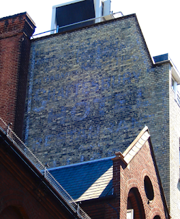
This might be the best hidden-in-plain-sight ghostsign in central London.

I have been busy pulling together some online talks about old defunct and faded signage of all kinds in central London, specifically Soho, Covent Garden and Fitzrovia. This has involved revisiting and updating my 'show and tell' folder and the accompanying notes for the central London walking tour I have been leading for the past three and a half years. 

When I first devised that route from Long Acre to Rupert Street, a friend and I test-walked it one sunny winter's day in Jan 2018. As we used the zebra crossing on Shaftesbury Avenue, heading from Seven Dials to St Giles Church, we turned to look back up Mercers Street just in case we'd missed anything and were amazed to spot a sign that neither of us in all our decades of wandering about armed with cameras had never noticed before. Way up high, facing north, there is a hand-painted sign on the back of what is now The Mercer Street Hotel.

Had it been covered and made a sudden appearance? Doubtful. We think we'd simply missed it due to the tree on the corner of Mercer Street than when in leaf as good as obliterates the sign completely for most of the year. Also, the sign is only visible from a couple of specific spots along that junction. Blink as you walk past Mercers Street and you'll miss it. See Google streetview here.

I returned to the site a few weeks later and did my best to take some photos. And I've tried again a few times since. It's difficult to get a decent view of it, because the weather, the angle of opportunity and the faded blue/white letters obscured by what looks like layers of black soot all play their part. I'm really glad that I have returned to all this because I was convinced that I had added this discovery to this site ages ago, but no, it turns out it was still lurking in my 'To Do' folder as a simple note to self.

This is what I have found out so far... 

The Shaftesbury Hotel was constructed on a site that previously George Russell's rope and twine business at 47 Great St Andrews Street (later to be renamed Monmouth Street – you'll see refs to these old street names on the road signs in the area). Images of Seven Dials, dated 1910, show the hotel covering the site of nos. 43-47, and this is corroborated by the gap in the directory for that year, hinting that the building was nearing completion. I think we can assume that the sign was painted onto the rear of the building during or shortly after construction, intended to be clearly seen by traffic coming down St Giles High Street from the junction of Tottenham Court Rd station when buildings in the vicinity were much lower than they are today. This hotel was probably at that time one of the tallest in this area.

It would have been an unusual and brave move to open a hotel here, albeit a cheap/budget one, in a district that had previously been tainted during the late Georgian era as being inhabited by thieves and prostitutes, a stone's throw from the rookeries of St Giles as depicted by Hogarth in Gin Lane. But by the 1880s the street of the Seven Dials had evolved to become merely an area where the working classes lived and worked, with a thriving street market. A clever entrepreneur must have seen the value of the central location as we do today.


I have done my best to decipher the wording on sign. I've boosted the pics using Photoshop and then on tracing paper hand-rendered the words that that are visible. My pencil marks indicate a few bits that I am unsure of, such as the wording above BREAKFAST which is probably BEDROOM being there are hints of a B and two OOs there. The big 4 looks to have been in a circle and was probably 4/- (four shillings) per night for a room, which equates to about £25 today. Wow! 

Billiards was very popular in the late Victorian era, especially within Temperance Halls, and I wonder if this was constructed as a Temperance Hotel being as the design of the building is similar to some others that were constructed in that era, such as The Kenilworth in Gt Russell Street near the British Museum, where activities and good food would have been an attraction rather than alcohol. Note that a bar/drinks lounge is 'missing' from the list of facilities offered on this painted sign. The 1915 directory sheds no light on this idea and simply shows it as Shaftesbury Hotel, Thos. Gordon (London) Ltd., at 44, Great St Andrew Street.

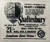
I also found this ad for the hotel in a 1953 guide book to London. As you can see, it is advertising the hotel's prime location as close to Theatreland and the West End – the heart of London. The price still equates to about £24 a night. You'll be hard-pushed to find a warm cupboard for rent at that price today!

An online search throws up no additional info or photos, indicating that no one else has spotted this corker of a ghost sign either. Ooh I feel like a treasure hunter who found gold! 

I am still intrigued about the two lines under BILLARDS which are not visible from the street... Can anyone give me access to the roof of the Odeon, Shaftesbury Ave?!

................

UPDATE (20th May 2022) – Sam and Roy @ghostsigns have finally caught up with me about this – they posted this 1917 ad on Twitter which backs up the wording on the painted sign:

This WW1 era ad shows the hotel proprietor as T. Gordon (London) Ltd., suggesting the company also managed other hotels/properties. This very same ad can also be found on the back page of the September 1918 Anzac Bulletin here – a fascinating read in itself. 

UPDATE 2 (12th May 2025) – a big thanks to Celia who contacted me via email and included this snap of an ad on the inside back page of the 1927 Authorised Guide to The Tower of London:

It's interesting to see how prices fluctuate. The price in 1927 per night/room (person?) is shown as 7 shillings and sixpence which, today, is equivalent to £32.30 and is therefore more comparably expensive that the rate in the 1900s and the 1950s. Note also that billiards is no longer advertised, helping us to date the hand-painted ghostsign as pre-1920s, and there are 15 fewer rooms available than in the 1917 ad above – I wonder if larger rooms were created or perhaps they were converted for other purposes, such as Jazz Age cocktail lounges